Pulse
End-to-end design of an ERP software for solar energy projects
The Product
Pulse is the ERP system designed to support the Operations Department in its day-to-day activities at ecoligo GmbH by becoming its single source of truth.
It provides the core services required to record, manage, and archive information throughout the lifecycle of the company's solar energy projects, which are developed and operated by teams across 13 countries in Southeast Asia (SEA), Latin America (LATAM), and Sub-Saharan Africa (SSA).
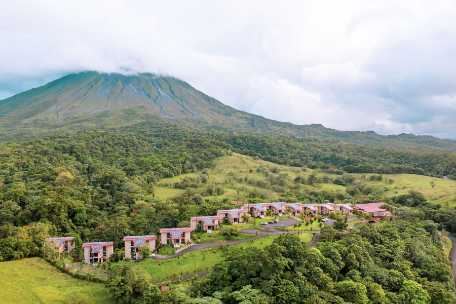

By centralizing client and partner data, it provides configurable business workflows while maintaining operational flexibility, and ensures that processes are traceable and compliant with internal and regulatory requirements.
Project overview
| Company | ecoligo GmbH |
| Product | Enterprise Resource Planning (ERP) Web App |
| Team | Operations Department → Product Team |
| Roles | Senior Product Designer I; Product Lead |
| Scope | UX, UI, design system; product specifications |
| Tools | Figma, Figjam, Illustrator; Jira |
| Timeline | Sep 2024 - Dec 2025 |
I was in charge of rebuilding Ecoligo's ERP (Enterprise Resource Planning) software at the design and architecture levels, including areas such as:
• Onboarding experience (user sign up, authentication, log in, log out)
• Offboarding experience (remove user, deactivate user)
• Database pages to manage solar operations, including client registry, contract management, and tracking of solar energy measurements
• Client invoicing based on solar energy tracking
• EPC partner registry, in order to achieve internal user conversion (i.e. discourage external tools use).
The business goal I was targeting was to centralize all the operations' data in an in-house developed product to hinder any inaccuracy in financial calculations, construction specifications, etc.
Challenges
Where and how to start? The answer is always with the users. I collected some of the main problems Pulse represented per department.
My day trying to find a project in the Pulse to update it starts with the frustration to wait significantly long for the list to load.
Updating several projects in the day becomes a patience game and ultimately a genuine productivity block.

Claire, Sales Agent
When the billing period comes, it's a nightmare to have to consult project by project to generate invoices. We need to re-enter all information manually from the projects into our invoicing system to then generate PDFs to be sent to clients. It's a very mechanic operation that costs us days of work.

Cristina, Accountant
We have to constantly correct data entered by people who are not part of our team. Because Pulse allows double roles, Finance people can edit Asset Management information, for example. This simply should not happen.

Ezgi, Operations Lead
Pulse has made everyone's work so ineffective that we had to start working with other programmes: Asana, Word, Excel. But this is problematic because now all our data isn't centralized anymore. We need a system where everything is connected.

Roberto, COO
Pulse was constructed with Java in a monolith approach. This is not ideal because the data stored is simply too much, the field names in the db make no sense, and this leads to redundancy. There are endpoints under different names doing the same thing. I don't dare fixing this without going through proper documentation, which does not exist.

Austin, Backend Engineer
To continue developing the backlog for Pulse is very challenging: Most of the recently added features are not documented, the expected behaviours are becoming a guessing game for QA and for myself; the designs on Figma are not in-sync with what's implemented in production.
That's exactly how you don't maintain or develop products.

Pris, Product Lead
Plan
The series of steps to tackle Pulse's redesign, that will be explained thoroughly as you continue reading this case study:
1) Conduct research
A deep investigation of everyone's problems is to be conducted. Focus groups and interviews might be the best methods for this.
2) Define user journeys
New personas and their journeys might need to be created after the research phase to understand what needs to be designed.
3) Prioritize journeys
Considering business priorities vs development dependencies, a sequence to spec and design features needs to be defined, aka our roadmap.
4) Start the UX phase
According to the outcome of the prioritization, specs and wireframes will be created.
5) Start the design ops phase
A new design system needs to be built to match the current FE technology and the company's new branding.
6) Start the UI phase
Once the wireframes and the specs are finalized by feature, and when the design system is almost * finalized, the creation of the final deliverable screens will start.
Research
💬 15 user interviews
to understand and lay out user journeys from the individual perspective in order to identify overlaps and contrast perspectives.
👩🏻🏫 8 user workshops
with different departments to analyse their internal processes and evaluate whether everyone is on the same page.
🧑🏻💻2 engineering analysis sessions
to assess Pulse's infrastructure status and decide where to start building, if refactoring is needed, or if everything needs to be built anew.
Findings
👉🏻 Deparments were not talking to each other when it came to share their processes. This led everyone in those departments to request the previous product team to implement db fields in Pulse that ended up being the same, but in different tables and under different names. So a lot of redundancy in the system.
👉🏻 Fields implemented were usually left optional. So even if they were in the system, some users just left them empty.
👉🏻 The problem wasn't primarily that the system didn't provide automation, but that processes were not standardized by department to even agree on how or what should be automated.
👉🏻 Processes needed to be standardized within the departments first, to then reflect them in the implementation on Pulse.
👉🏻 On the Engineering side, it was recommended to actually rebuild Pulse because of all the redundancies in the database found by the team and because the infrastructure approach was not ideal in their opinion. As this would also affect endpoints, the concensus was that it'd be faster to rebuild than to fix. And with that, we went from a Java monolith to a Python microservice architecture.
Conclusion
The research phase shifted the project focus from just rebuilding a new UI for the same backend to solving a broader understanding problem.
Instead of designing the screens cosmetically, the challenge was reframed around:
• Understanding the processes created by the departments, so they could be implemented at the product level.
• Creating a high-performant product foreseeing the data load generated by all departments in different countries.
• Simplifying all designs to help the users get their tasks done faster, as much as allowed by the processes dictated by the department.
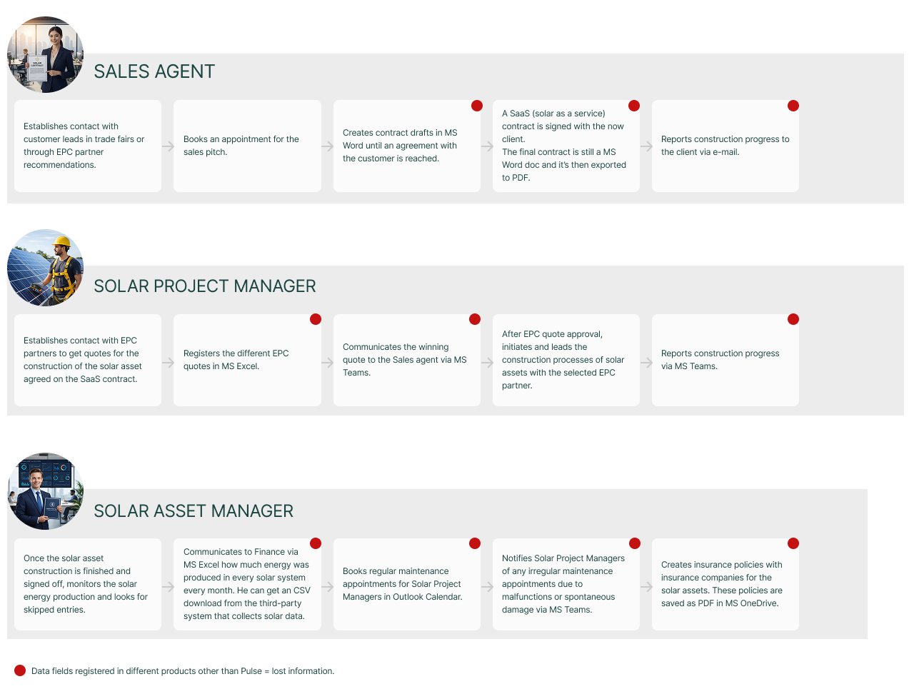
User Journeys
Creating these user journeys out of the research helped me and the team understand how to tackle the order of features, given the fact that we could identify the starting points of each phase and what was needed, as well as points that weren't even recorded in the original Pulse.
Data Flows
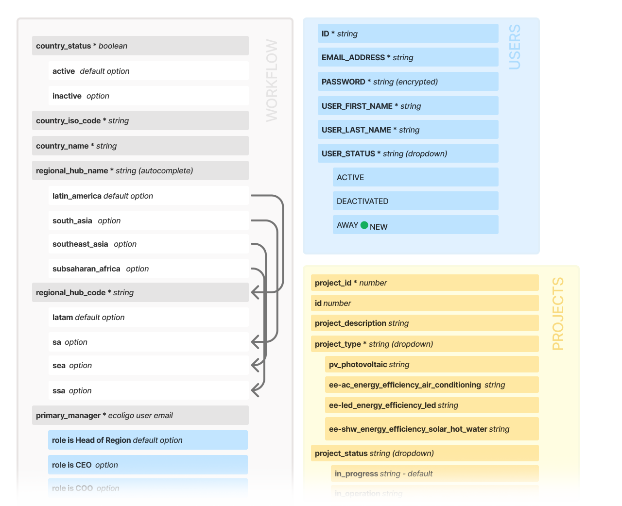
With the user journeys as base, I created a master map, which I called Data Flow, with all the database fields needed per service (corresponding to features) and iterated with the Backend Team to detect any possible problems. This gave us the foundation of the services databases. Here below is a snippet of the data flows:
Design Ops
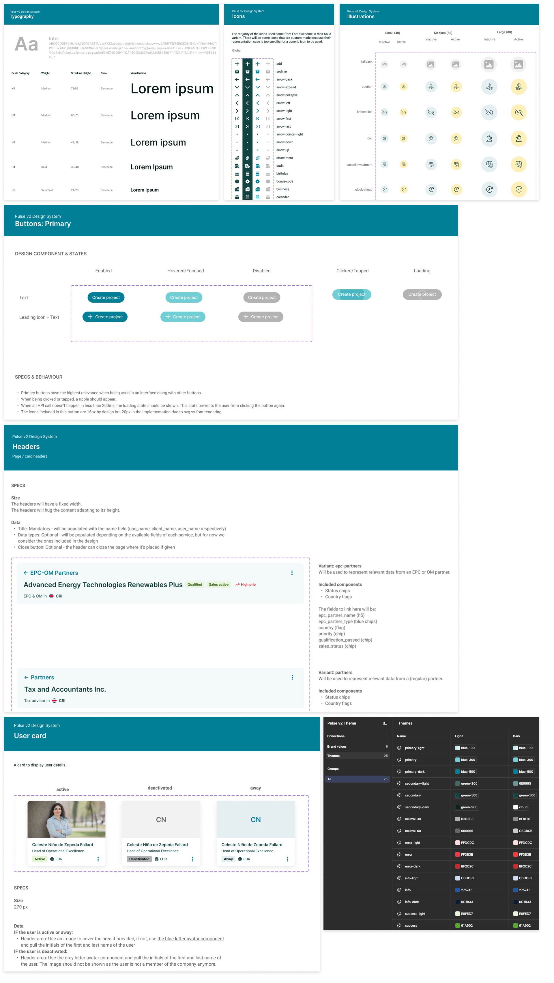
The new design system that was created for Pulse v2 followed WCAG standards, Material Design / React standards, and ecoligo's new branding.
It was structured in 4 parts: Assets, Styles, Components, and Organisms (custom components). Here's a glimpse of some assets, styles, and components.
Design solutions (by feature)
In this section, I will condense the UX and UI side of things described in the Plan and only focus on the features that were key to the development of the whole system: the ones that were needed for every other dependency that would exist in all services.
User management
| Problem | Users had overlapping roles due to the possibility to have many - meaning some users had effective reading and editing permissions of information they should not. |
|---|---|
| Constraints | The backend needed to be rebuilt as a separate microservice to create a single-role model. |
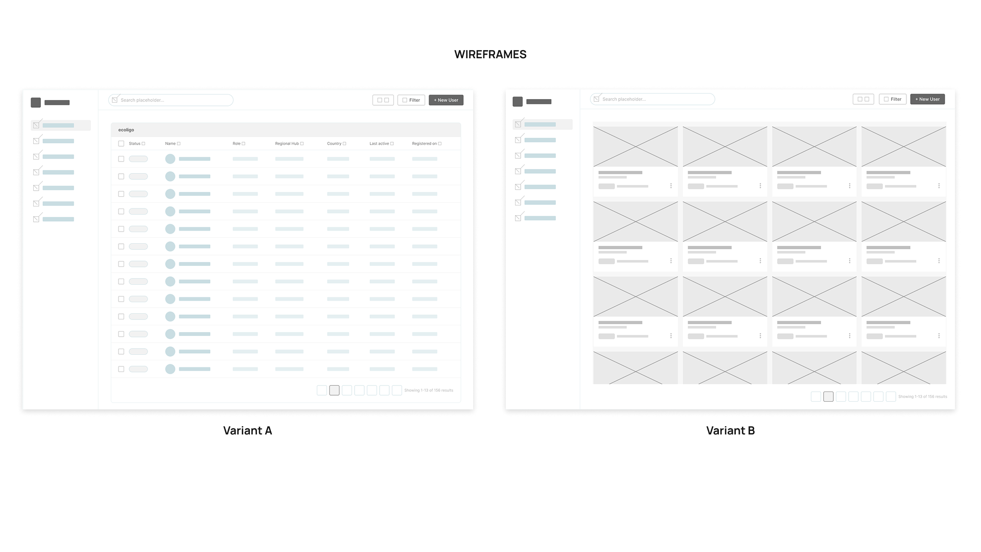
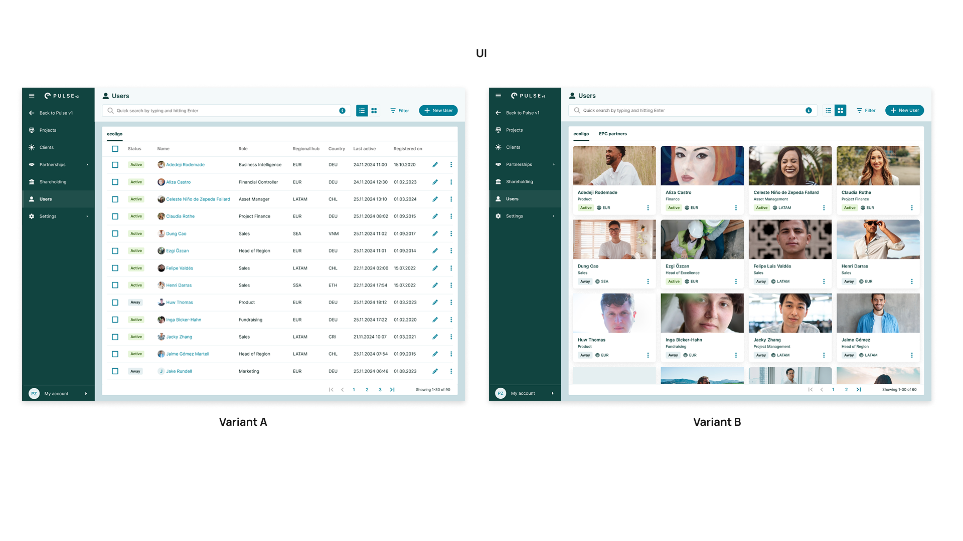
Different layouts were presented for the Admin role, since only admins would be able to perform user-related actions, like adding users to the system or deactivating or deleting their accounts.
• Variant A was intended to cover the needs of the Admin role. It presented a table with batch action possibilities to deactivate, delete, or edit users.
• Variant B offered a card-based layout, which didn't facilitate the batch actions, but had emphasis on the human side of users, by displaying a larger picture for instance. So users who wanted to know who their colleagues were, for example.
In the end, Variant A won the Admin preference, but the card-based layout was also included as part of the scope of the final solution because it believed to be useful for the non-admin roles (basically everyone else who needed to get "acquainted" with team members in other regions, for example).
I collaborated with the Head of Region EUR, who was in charge of overseeing the standardization of the processes for the rest of the regions where the company was operating, as well as with the Data Lead and the Operations Lead, to corroborate the roles that everyone should be assigned when the system was created.
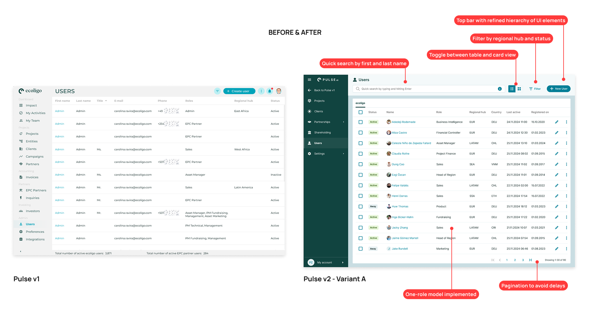
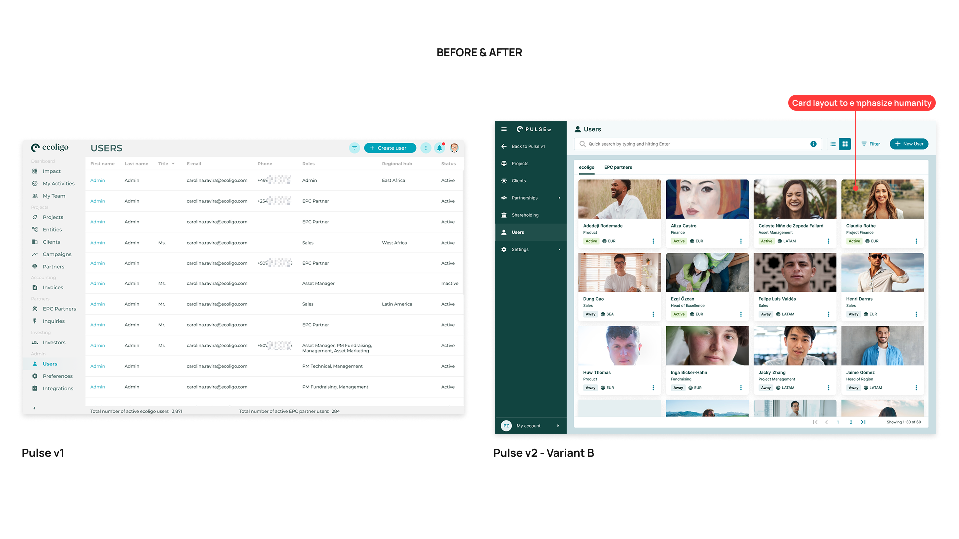
Here is a short recording of the prototype for Admins, which shows some the toggle between the views and a sneak-peak of the filtering experience.
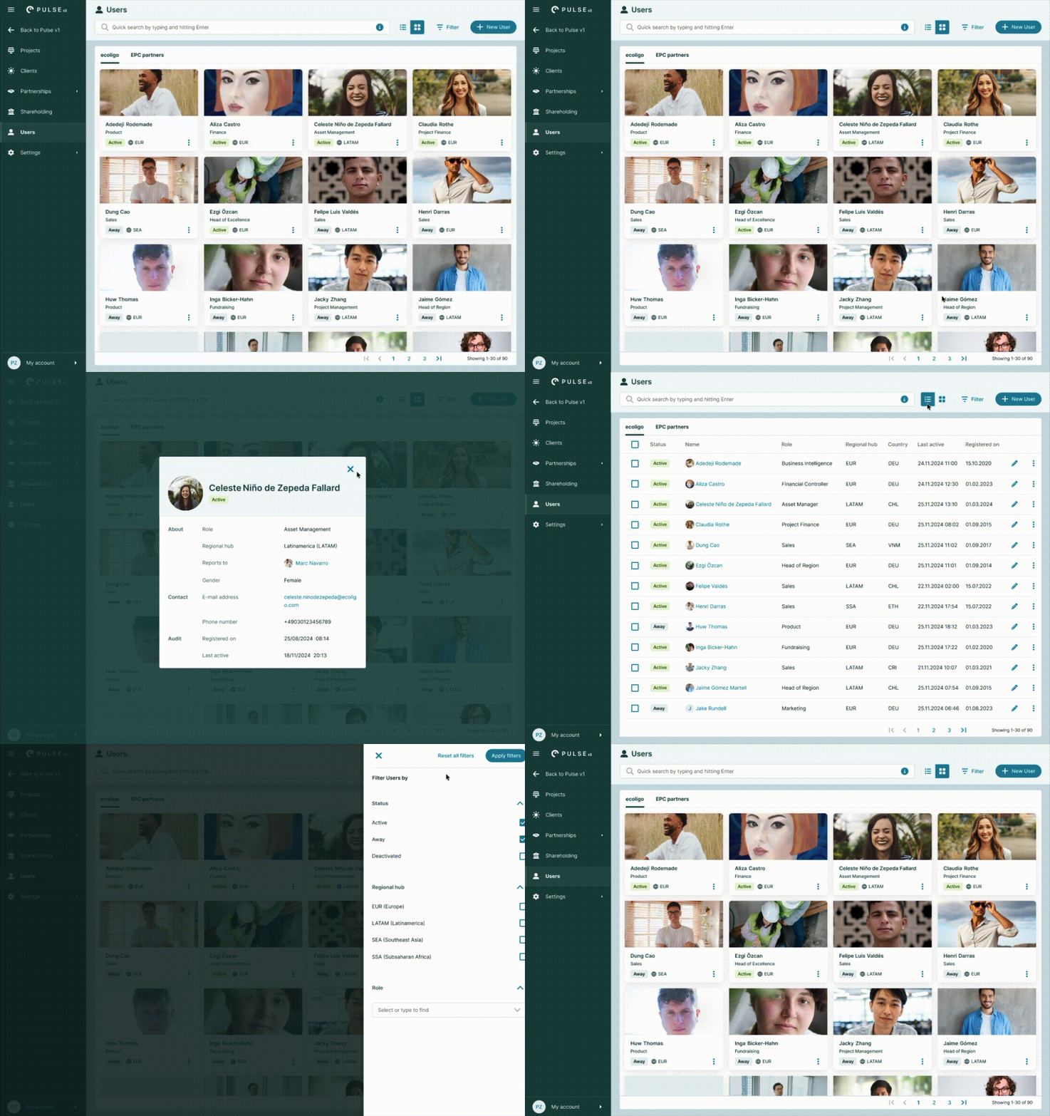
• Variant B was released with the first version (MVP) of Pulse v2 🚀. Variant A was postponed due to product prioritization - the system didn't have enough users to justify batch actions.
• We got good feedback about the fresher look of the card layout page 😊. On the table layout, even though it was not released with the MVP, it is to be highlighted that during the user tests, admins found it less tedious to execute operations related to users while feeling the table more readable due to the color present in the status chips and the introduction of circular avatars.
Country management
| Problem | Users were manually entering the same country information (grid emission factors, VAT and WHT values) again and again to create contracts; or they were creating contract types that were not legally allowed in certain countries; and this impaced financial calculations, project specifications, etc. because it led the data entered to be erroneous because typos. A centralized service (called internally the country service) where all this information could be available was necessary to provide some automation and reliability. |
|---|---|
| Constraints | Creating a bunch of API endpoints to connect the country service with specific data points in other services, like projects and invoices. |
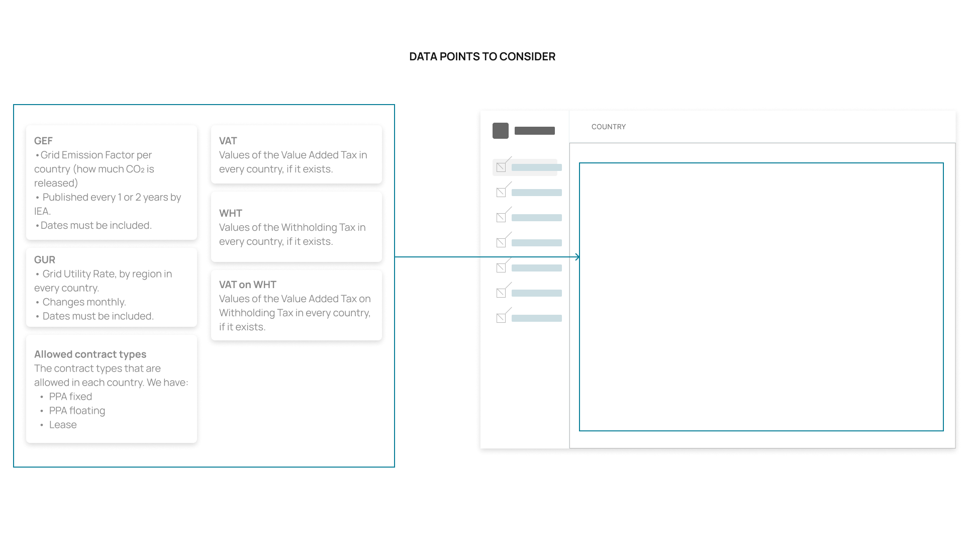
Mandatory content blocks
Different mandatory content blocks needed to be considered to build the layout.
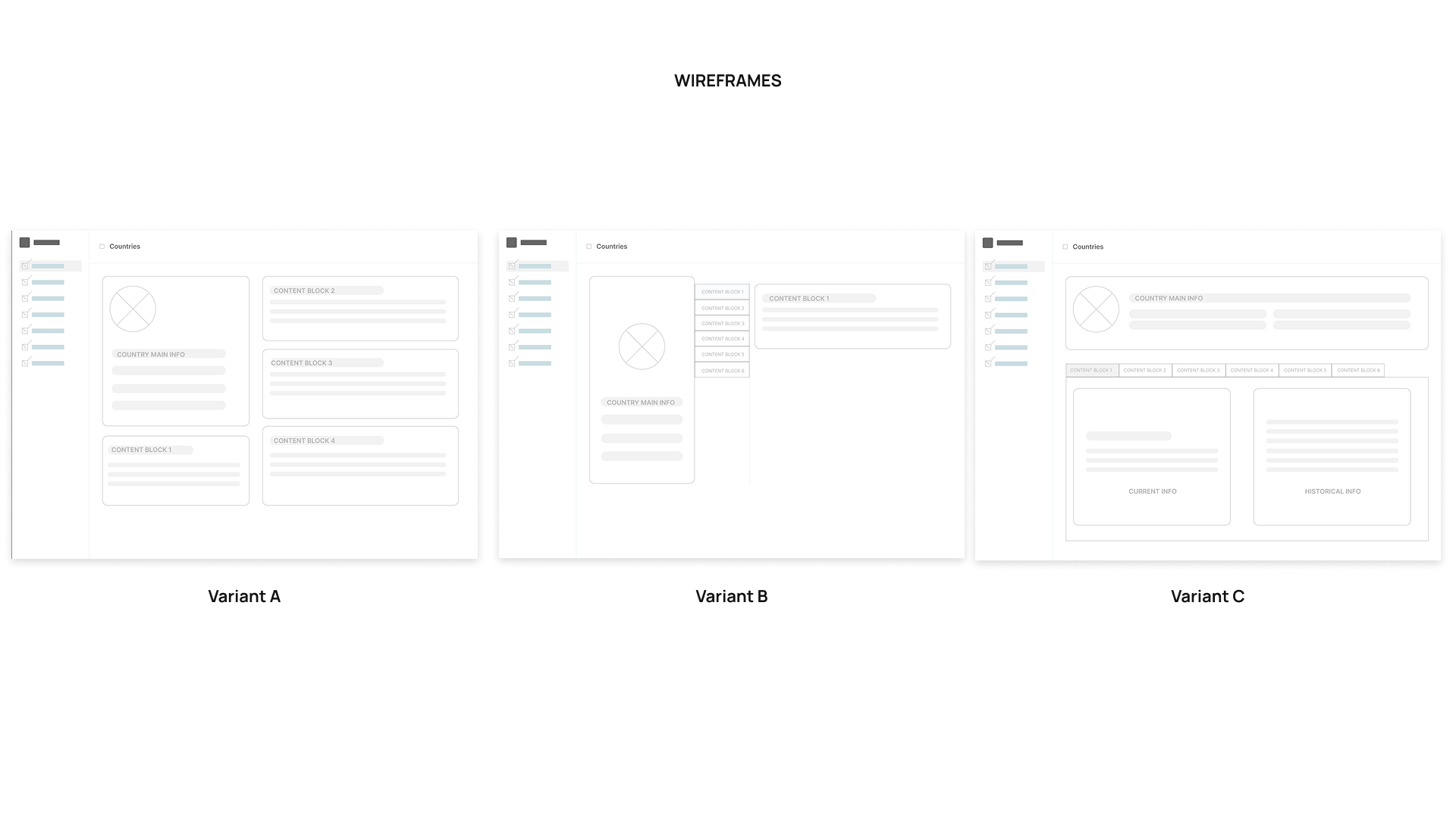
Layout proposals
Preamble:
• The access to this screen was located under Preferences, because it contained data points that affected other services.
• The countries would be presented as a table during the first iteration, then the user would click on each row to then access the contry's specific information.
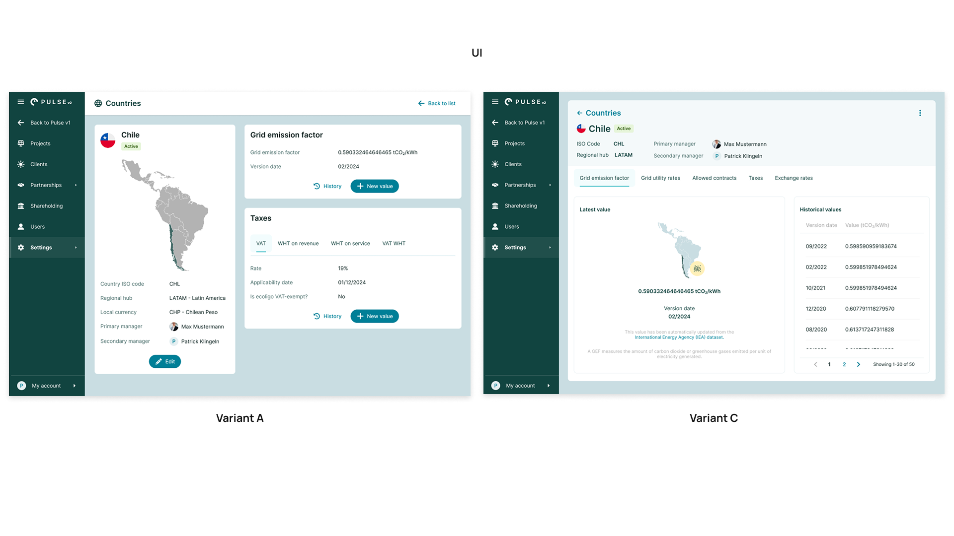
• Variant A presented a card collection with the different blocks, giving more importance to the visual aspect of a map to locate the country in question in an effort to be ludic about it.
• Variant B offered the map view plus a vertical tab layout that isolated the blocks to be browsed one by one.
• Variant C offered horizontal tabs with the same block principle as Variant B and the header the other database pages had.
In the end, no UI for Variant B was generated because from the design perspective, it was foreseeable that it wouldn't work well.
Variant C proved to be more visually appealing by its cleanliness and similarity to other pages in the system. The blocks in Variant A were thought to be disorganized because users could not really find an order to read them.
Other tabs
It was decided that the main tab would display the Grid Emission Factor of the country, as it proved to be the most useful information for the majority of the users.
The other tabs had then less importance according to the number of users and number of consultations in average.
• The Grid Utility Rate tab contained the compilation of all rates existing by zone, city, or region, depending on the country. Because between countries the information isn't standardized with a format or file type (some used PDFs, others, Word documents, and the worst case was screenshots of Excel files), Sales users needed to input everything manually, and this information would be later replicated to contracts or invoices, while we could work on an extraction-oriented solution.
• The Allowed Contracts tab contained the rules of which contracts could be offered in the specific country. Because of different laws or regulations, not all contract types we modelled were valid in some cases. So here the users with role Head of Region could choose which ones to apply having such regulations in mind.
• The Taxes tab allowed the Finance users to define the taxes applicable in each country, as well as the values and the date of application/validity.
• The Exchange Rates tab was introduced at the end after agreeing with the Sales and Finance teams, that a ER source needed to be standardized in the system. Via script, the ERs emitted by the European Commission were then synced, and then users from these teams could use the tab as reference instead of browsing the EC website directly.
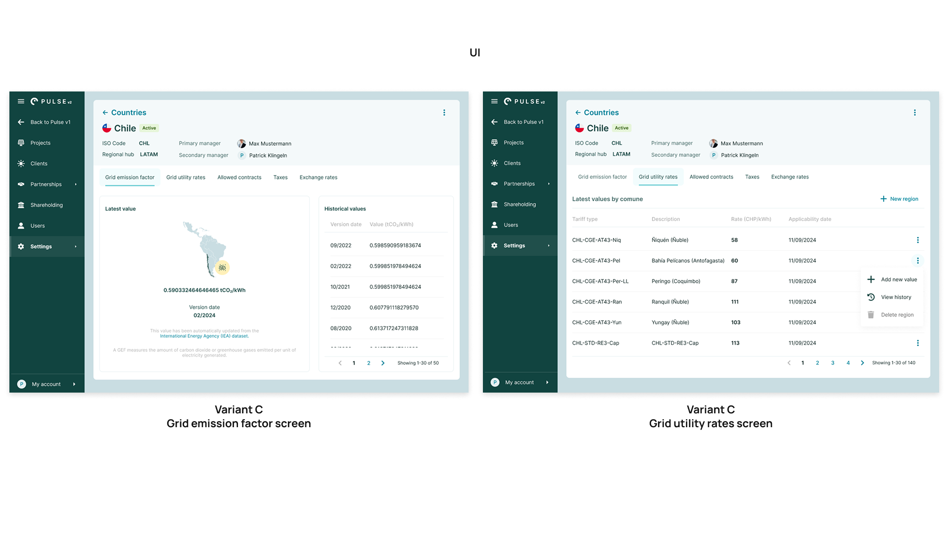
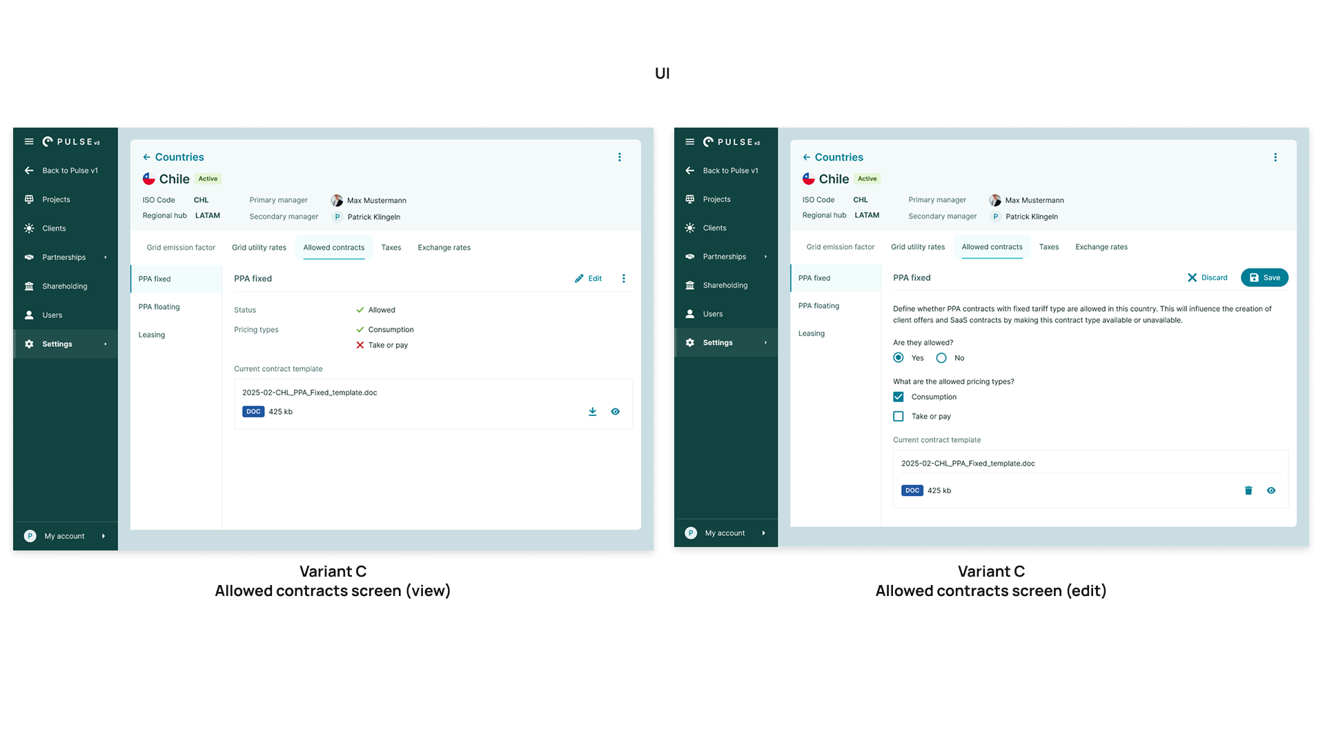
I collaborated with the Head of Region EUR, who was in charge of overseeing the standardization of the processes for the rest of the regions where the company was operating, as well as with the Data Lead and the Operations Lead, to make sure they were informed of these structural changes so they could also follow the naming conventions and nomenclatures in their systems and outputs.

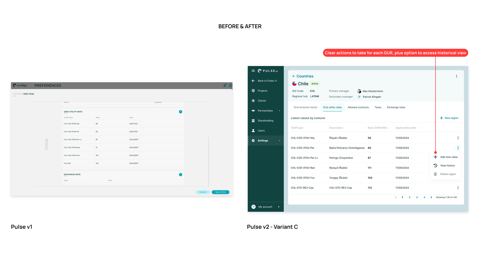
• Variant C was released with the first version (MVP) of Pulse v2. 🚀
• The feedback gotten after the launch and first usage was very positive. Users had no trouble understanding that these datasets were the backbone of any operational output they and their teams might need to generate. Everyone was happy that the data points didn't need to be updated manually by contract, invoice, or offer anymore.
Learnings
💻 From the technical perspective
I learned having joint sessions with the Engineering Team from the very beginning, in which Product Managers, Designers, and Data Analysts also participate, is of great benefit to understand how to map an application meant to evolve and with numerous dependencies between data points. Having created a master data flow was the best approach to aid visibility for Backend, QA Engineers, and occassionally, Frontend Engineers.
👥 From the stakeholder alignment perspective
I learned and appreciated that constant and not excessive exchange of what's happening in the department is of vital importance in case there are changes in protocols, rules, or legal aspects that would directly impact our development. Having worked together with the Process Lead, the Data Lead, and the Head of Region (EUR) gave me a wide visibility of all these moving parts, in addition to deeply understanding use cases among regions and other departments.