ResearchGate Mobile
Designing an Android app from scratch for the largest online scientific community
The Product
ResearchGate is an online platform that allows scientists and researchers to access over 160 million publication pages and stay up to date with what's happening in their fields, as well as networking with their community, sharing their research, fostering peer collaboration, and getting in-depth stats of the impact of their work, by scoring their influence and keeping track of their citations.
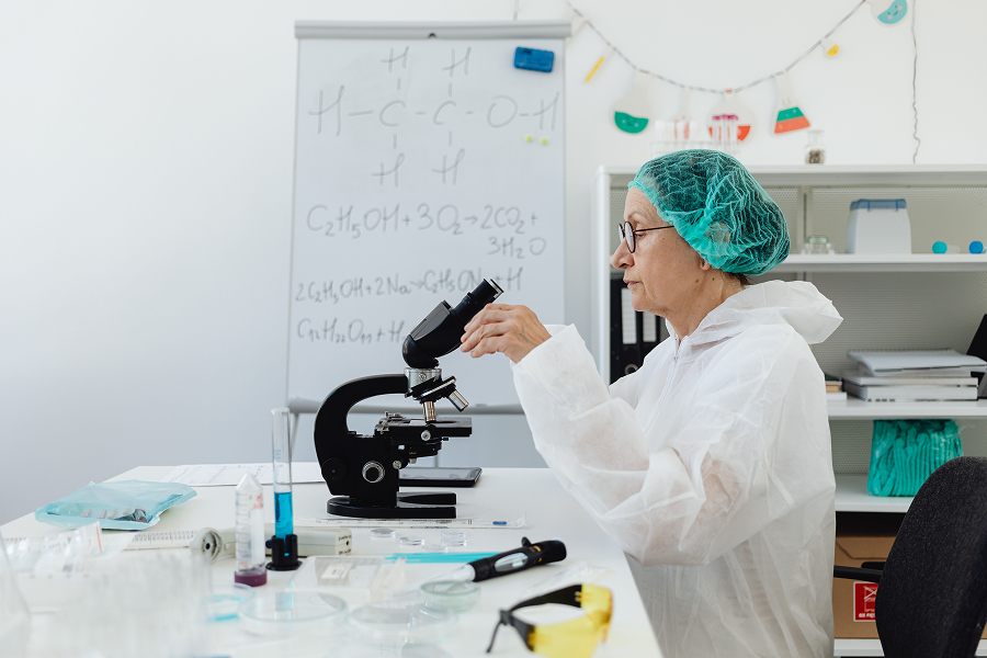

RG is currently used by 25 million scientists around the world, as of 2023. It is considered the largest professional social network for scientists and researchers by active users.
Initially designed for undergrad and graduate students, RG's main motivation has been to provide free access to scientific publications to make knowledge accessible.
Project overview
| Company | ResearchGate GmbH |
| Product | Android Mobile App |
| Team | Product Department → Design Team |
| Roles | Senior Product Designer I |
| Scope | UX, UI, design system |
| Tools | Figma |
| Timeline | July - December 2022 |
I designed ResearchGate's Android app from scratch, including the login, feed, profile, publications, and navigation experiences to increase engagement with the platform as well as alleviating the primary need of keeping up to date with new research being published.
Challenges
Where and how to start? The answer is always with the users. I collected some of the main problems that the iOS app as long with expected behaviours of certain features.
It's like the algorithm is recycling posts. I get the impression that the suggested posts are repetitive. I've found some of them like 10 times already.
PhD candidate, Max Planck Gesselschaft
Why do I bother to fill out my interests on my profile if nothing related to them gets suggested on the feed? If I list an interest, I expect to see publications about that specific interest.

Professor associated to Charité Universitätsmedizin Berlin
In 2021, it's inconceivable that there is no ResearchGate Android app. Why is there a preference for iOS?

Researcher associated with LMU
The iOS app is very basic and just offers the feed. The rest of the functionalities found on the web aren't available and that's disappointing.

Researcher associated with Max Planck Gesellschaft
Plan
The series of steps to tackle the app's design, that will be explained thoroughly as you continue reading this case study:
1) Desk research
Benchmarking, reading appstore reviews, and being aware of the feedback provided by the Customer Success and the Web User Research Teams are the first steps to see what needed to be done.
2) Feature map
The maps of implemented features in the iOS and in the web app need to be created and then contrasted to see the dimension of existing disparity, to then make the Product Manager aware of these.
3) Define role-based personas
Role-based personas and their journeys need to be defined because the visualization of certain screens will be different depending on those roles.
4) Start the UX phase
Start the wireframing process of the features that the Product Manager prioritizes. Evaluate such variants with the other Head of Design.
5) Start the design ops phase
A new design system for the mobile apps needs to be created, based on the web app one, following WCAG standards and with tokenization included.
6) Start the UI phase
Once the wireframes and the specs are finalized by feature, and when the design system is almost * finalized, the creation of the final deliverable screens by feature will start.
Desk research
🔎 3 research apps benchmarked
to see what they were offering: from features to experience, to methods to login and sign up.
⭐️ Around 40 analyzed app reviews
to understand the user preferences and frustrations with the iOS app.
😬 Hands-down, more than 500 feedback messages
from the customer success platform that directly mentioned the mobile app, plus the findings that the User Research team gathered in previous years. Still in the times without AI, I went through all of them, prepared a trend graph, and understood why everyone seemed to hate the app.
🗺️ Feature map
of the web app and the mobile app. This revealed the lack of features present in the mobile app and opened the discussion on what to tackle first with the rest of the team.
Findings
👉🏻 The app did have some web functionalities implemented... under another name, making them not so easy to identify or even find. Name harmonization was non-existent in the UI and the backend.
👉🏻 Users were expecting to get automagical suggestions more often.
👉🏻 The publication design and the feed needed to change drastically. The appearance was, for lack of a better word, buggy.
Conclusion
The research phase shifted the project focus from reimplementing what was on the iOS app on Android to working to close the gap it had with the web app.
Consistency needed to be achieved in the terminology and messages displayed in the app, with help of the Content Design Team and the Legal Team.
Design Ops
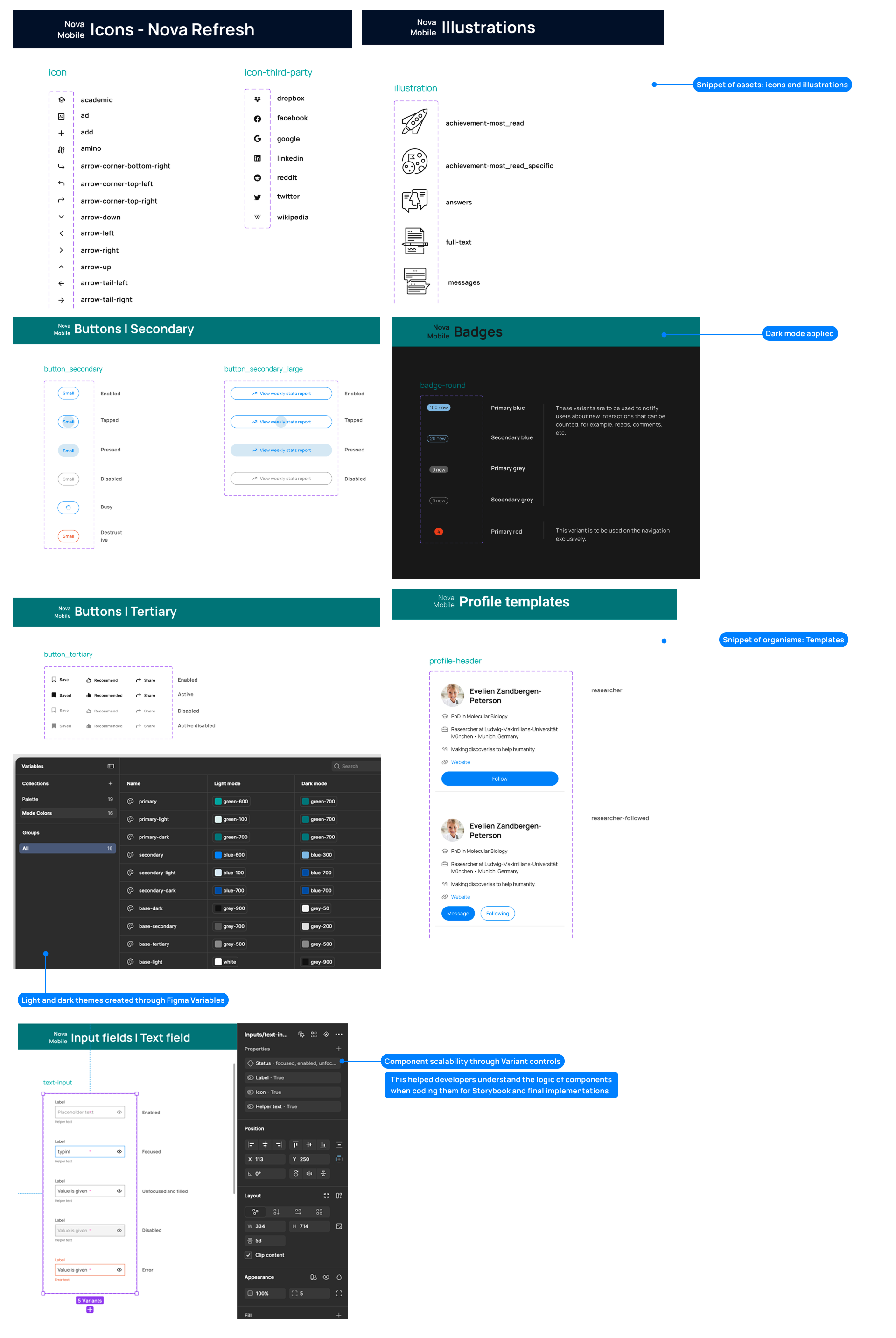
I adapted the design system to mobile standards - and in a way, it meant I had to create a system for mobile anyway. The Design System Team was in charge of maintaining the system for the web app, but it fell under my responsibility to update and keep the mobile system up to date.
I changed the components a little bit to comply better with Android standards and WCAG, while also creating light and dark theme equivalents with their respective tokens.
Design solutions (by feature)
In this section, I will condense the UX and UI side of things described in the Plan and only focus on the features that were key to end the pain point of not staying up to date.
Main feed
| Problem | • Users felt that the publications appearing on the feed were random: It was not clear whether they were sorted by upload date or by other researchers' recommendation. • The publication cards were not visually distinguisable - where does a publication begin and end? |
|---|---|
| Constraints | • The backend used in the app needed to be rewritten to match the logic of the web app. • New features needed to be developed to achieve parity with the web app. The app user flows needed to be documented and updated to match those found in the existing web app implementations. • All screens needed to be done from scratch. |
Feed qualifiers
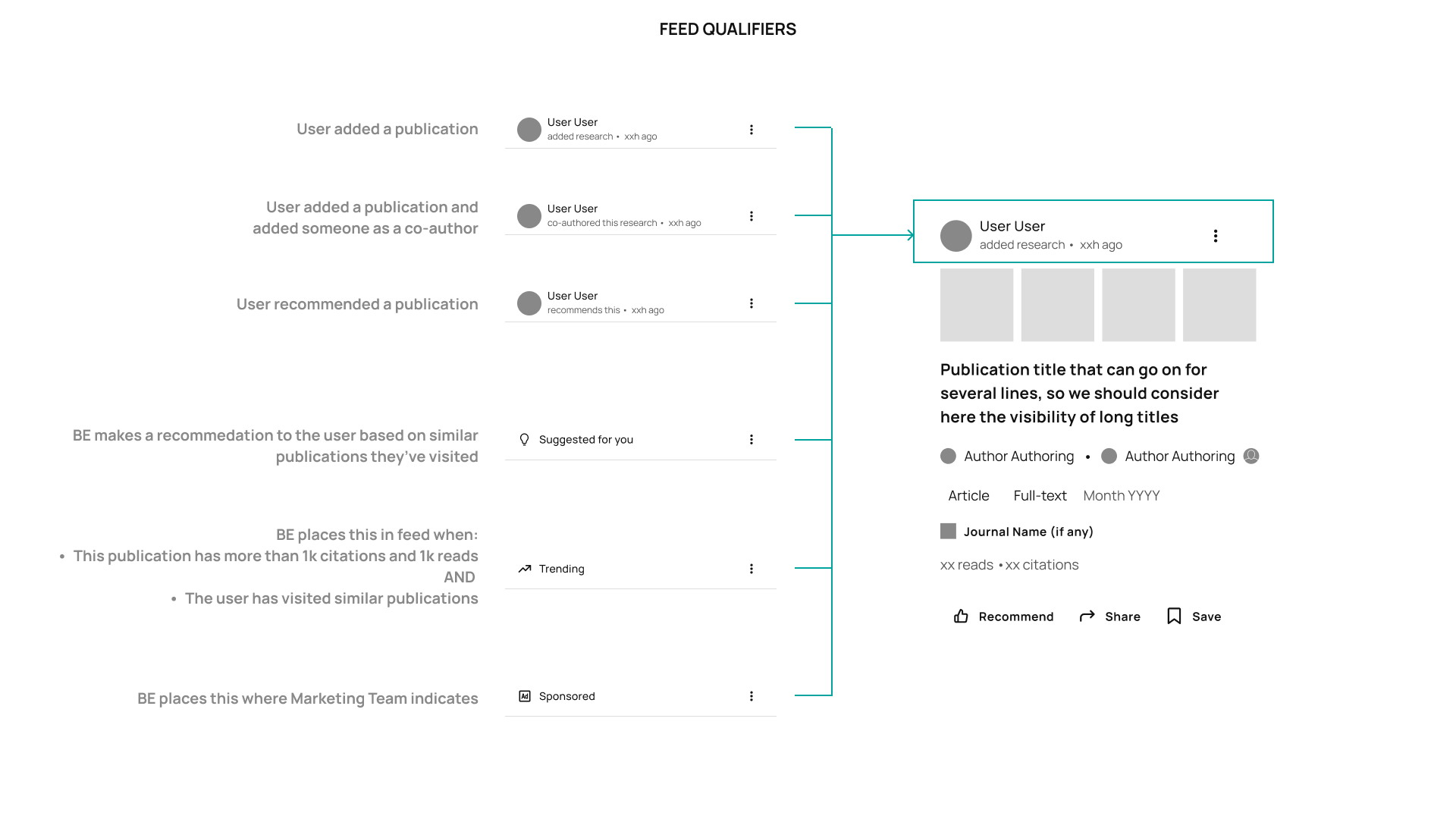
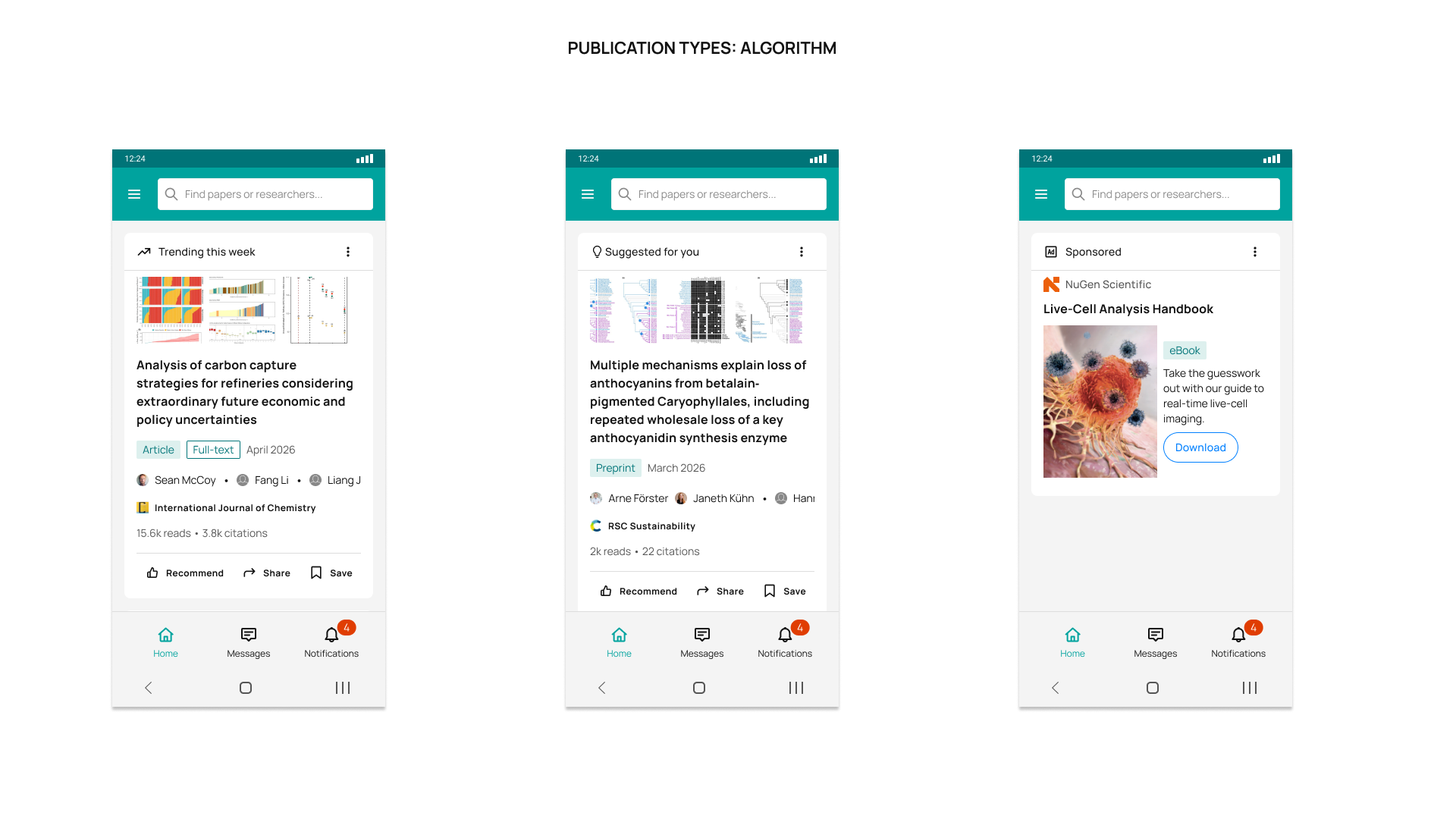
The first aspect to tackle was the feed card qualifiers to establish a distinction between what users from a user's network were posting, versus what they were recommending, versus what the system was suggesting, versus ads.
Feed card layouts
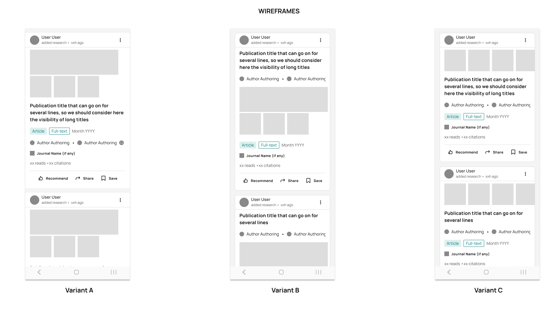
Different layouts were presented with different information hierarchy after what users had told us to be relevant for them to see at first glance.
• Variant A showed a simpler layout with full-width cards, emphasizing the figure collection attached to the publication as a grid, followed by its title.
• Variant B offered a card-based layout, emphasizing the publication title and its authors, followed by the figure collection as a grid.
• Variant C offered the same card-based layout as Variant B, but the emphasis was on the figure collection, followed by the title and the authors. The figure collection was different. It presented figures with the same size and integrated the idea of scrolling horizontally to see more of them, instead of having a grid.
In the end, Variant C proved more visual consistency and allowed for more information on scroll, so it was the chosen option by the team to be further validated.
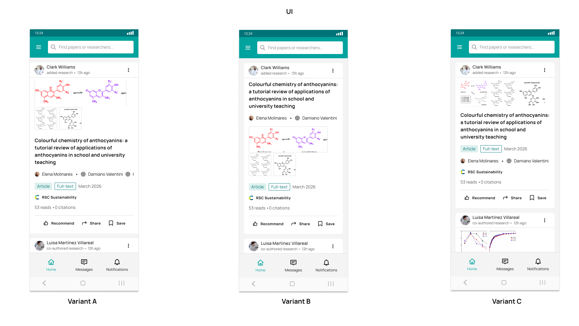
I collaborated closely with the Head of Design and the Web App Product Designers to ensure the proposals to be aligned with the web app; as well as with the User Research Team to organize in-person interviews to validate the ideas.
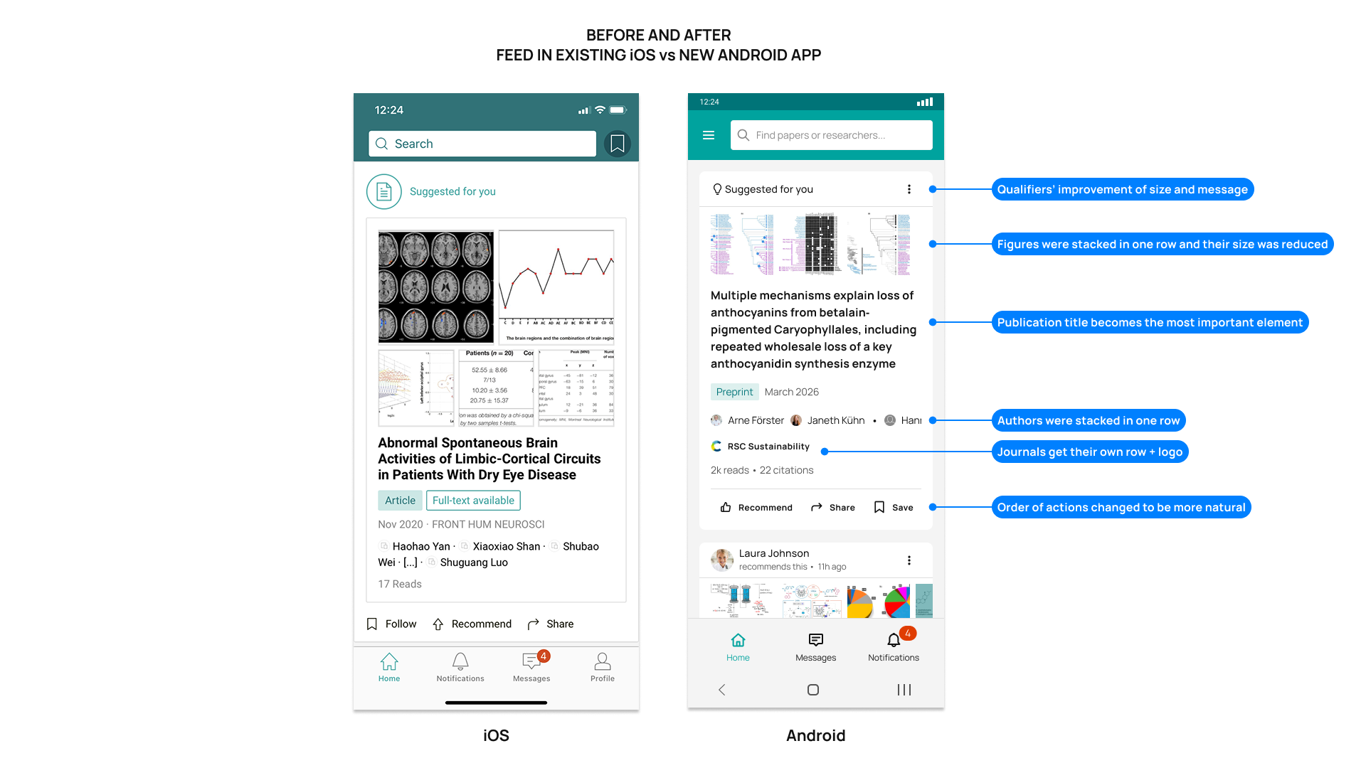
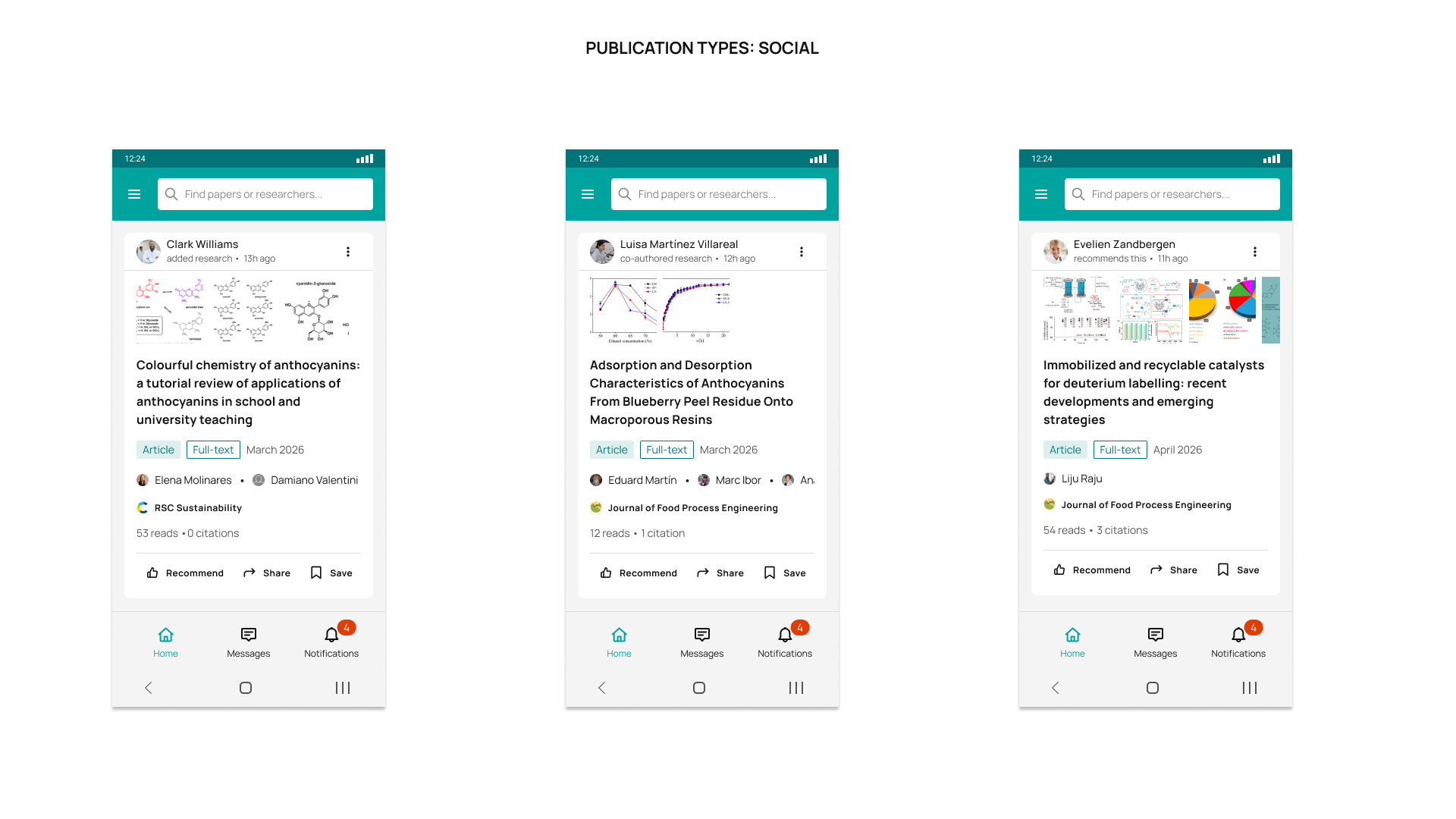
Here is a short recording of the feed interaction:
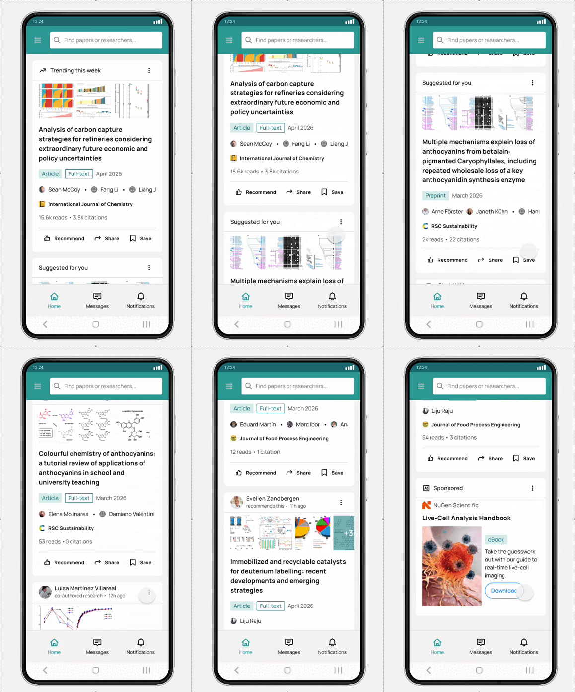
• The selected feed design was released with the iOS app version 1.2 and the Android version 1.0.
• The feedback gotten via app ratings was generally positive. Some mentions included that the feed was easier to navigate and that it looked fresher.
Publication details
| Problem | • Users felt that the details of a publication were scattered all over the screen. There was no real logic to read the different areas, especially when it came to reading the abstract: the figures were in a completely different place, so it was cumbersome to open the figures and then scroll back to the abstract. • The actions related to the publication felt randomly placed. |
|---|---|
| Constraints | • New features needed to be developed to achieve parity with the web app. • The app user flows needed to be documented and updated to match those found in the existing web app implementations. • All screens needed to be done from scratch. |
Publication header
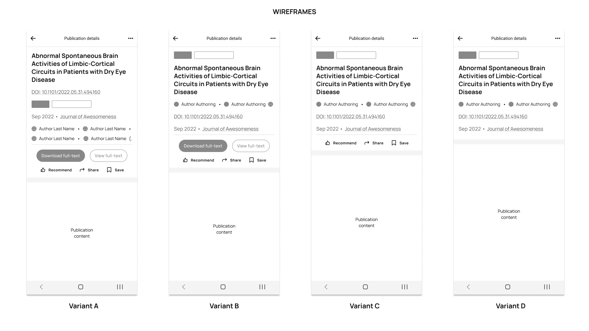
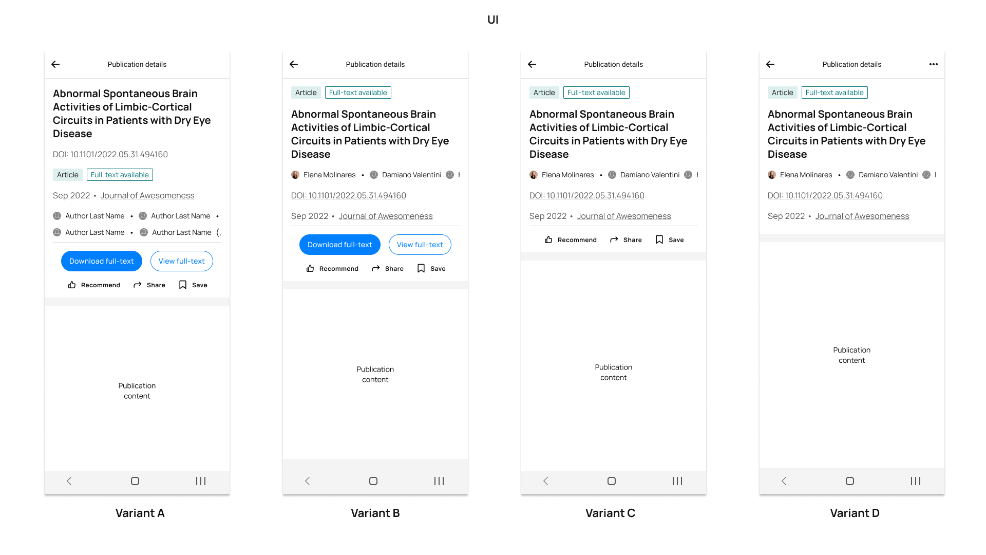
Different layouts were presented with the relevant information of the publication title: The title itself, authors, DOI, publication type, whether the full-text was available, date and journal of publication. In addition, the social buttons and the action buttons (to view and download the full-text) were made available.
• Variant A emphasized the publication title and the DOI. The authors were presented as a list, just like in the web platiform.
The other variants (B,C, and D) emphasized the authors, DOI, and date in that order, but explored the fact of keeping buttons or not. In this sense:
• Variant B offered the full set of buttons: Download full-text, view full-text, and the social buttons (recommend, share, save).
• Variant C offered only the social buttons.
• Variant D offered only the top app bar button, where all those functionalities could be outsourced to.
In the end, Variant C proved to be more visually appealing by its cleanliness and to provide more familiarity according to users' input. Most of users expressed not needing to download the full-text to their phones (this is more a desktop use case) or having the option to view it with most prominence either.
Publication actions
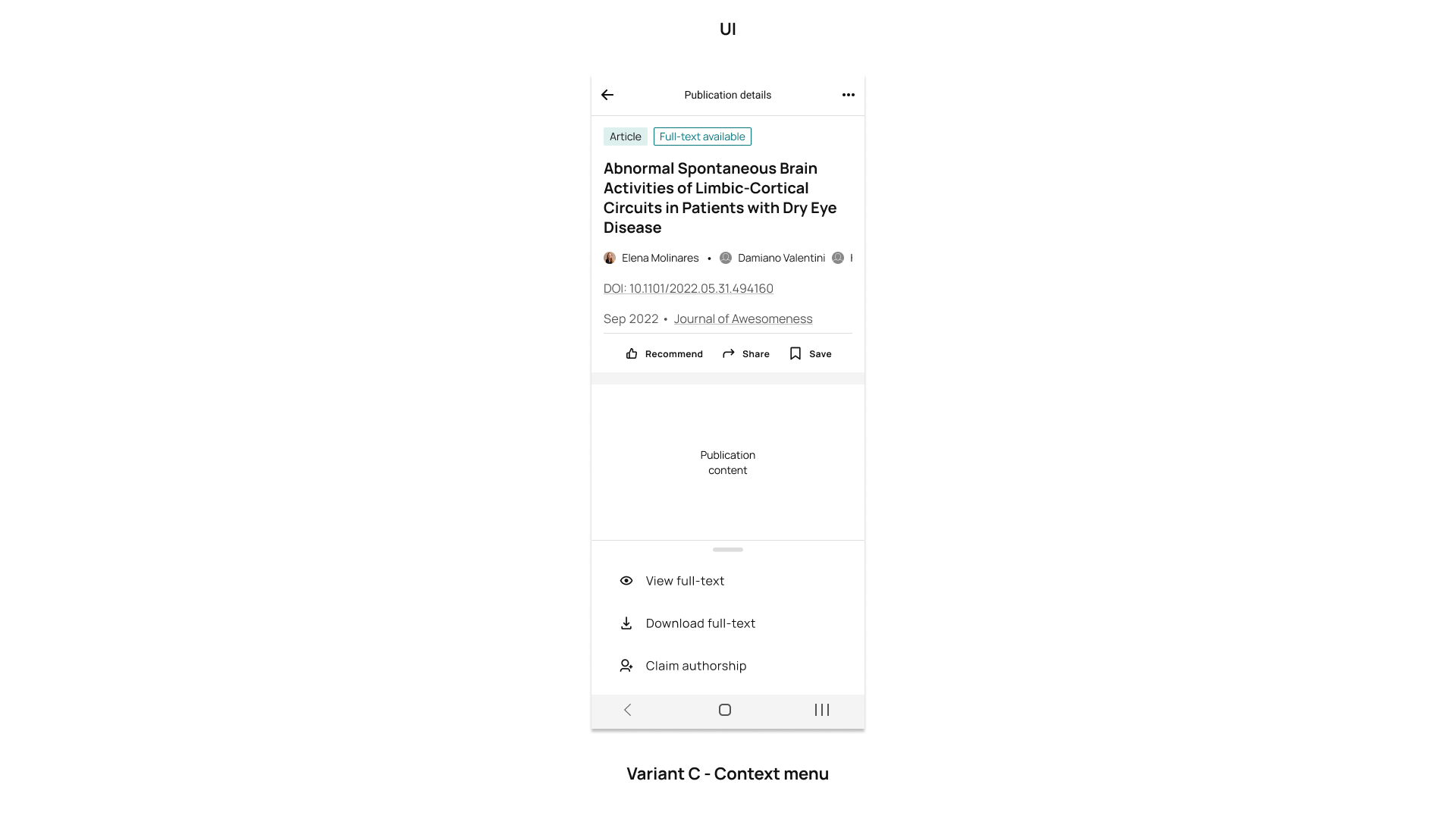
Because the file-related actions were outsourced to a drawer in the top bar, its design followed.
• These actions were the first ones to be listed in order of importance.
• Other important actions, like sharing externally (social media, email) and claiming authorship of a publication, were considered for this menu.
Publication content
As stated earlier, the main problem perceived with the contet was how the abstract was constructed: the figures were not in the same block as the text, so it was cumbersome to open the figures and then scroll back to the abstract to have continuity.
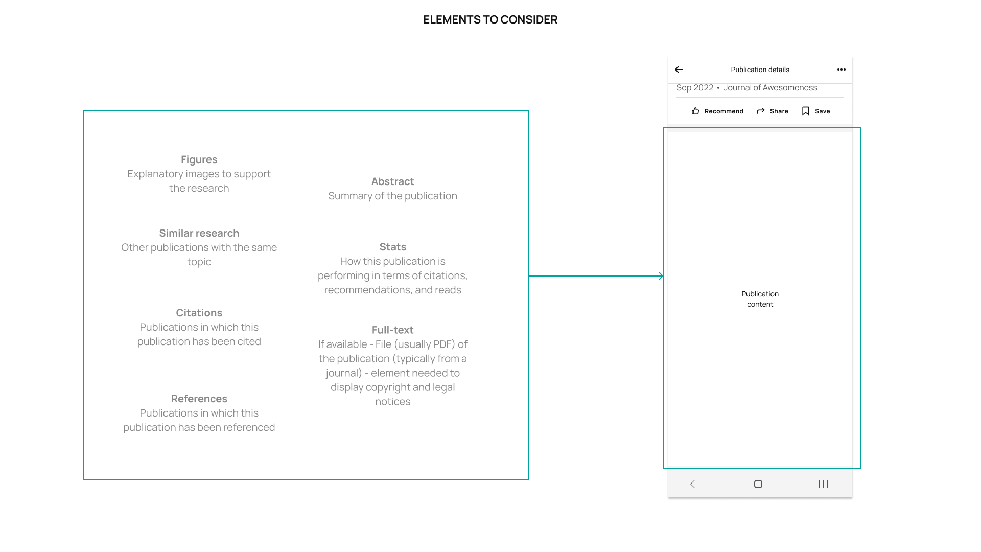
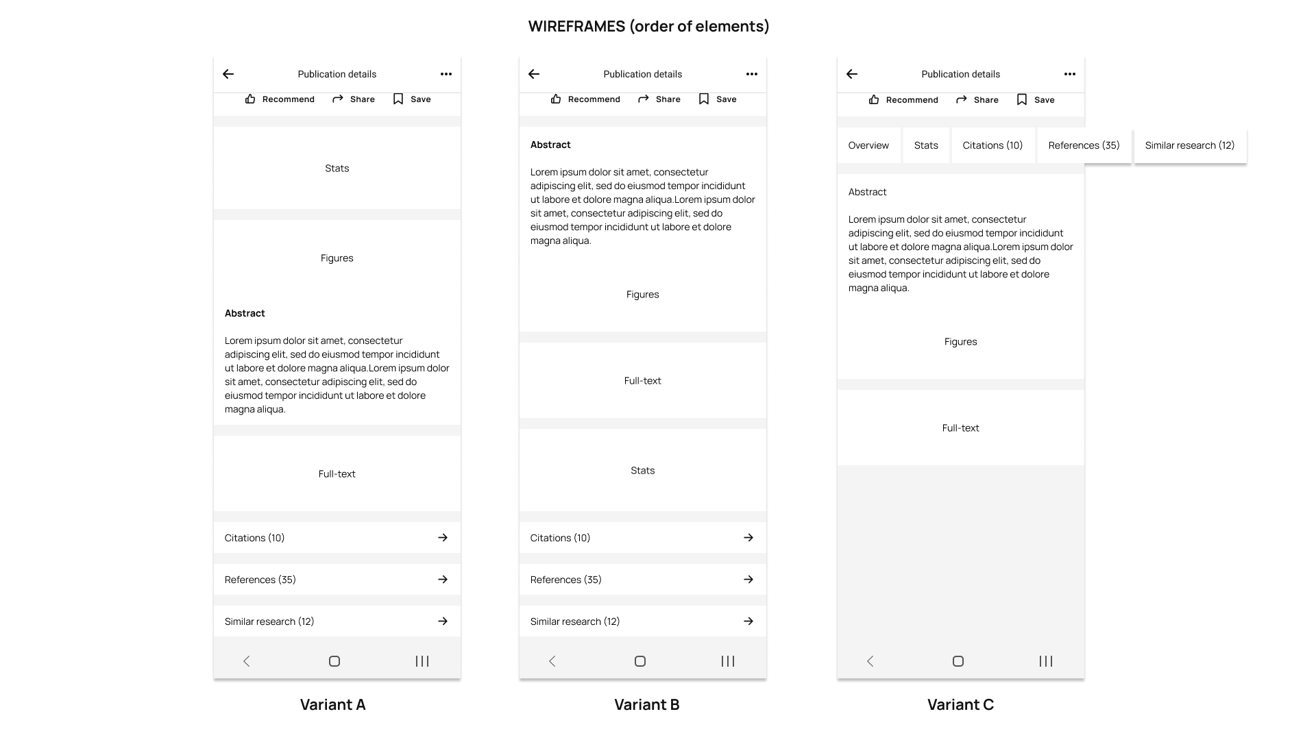
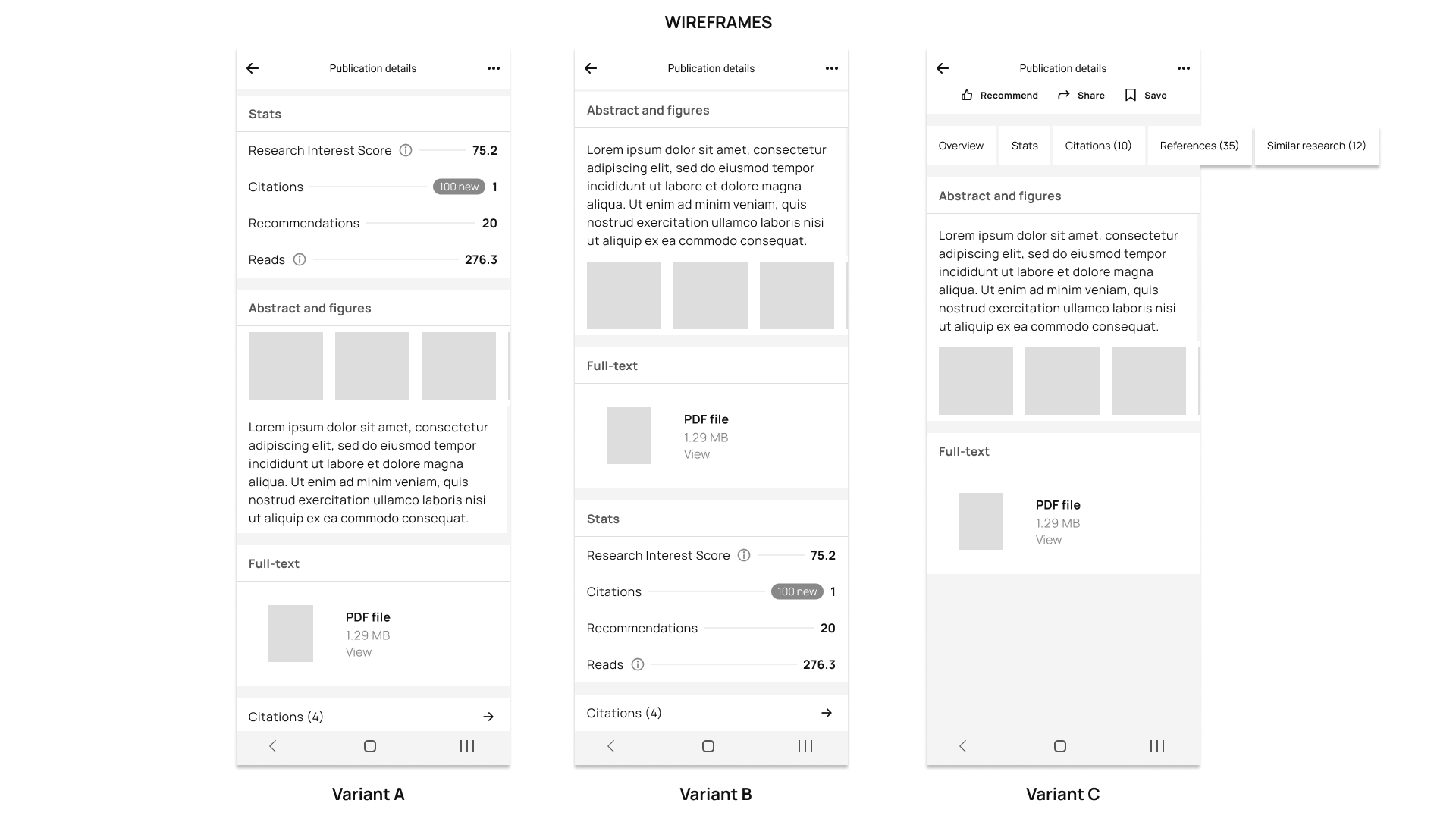
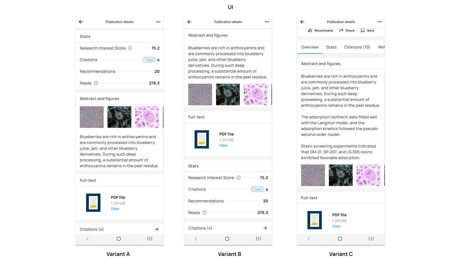
• 3 variants were created to visualize the best ways to present all these blocks.
• Variant A followed the structure given in the web version: Present the stats, then the abstract and figures, then the full-text file (if available), and the related areas (citations, references, and related research) accesses.
• Variant B presented the stats above the related areas.
• In Variant C, a tabbed approach was considered to not have so many blocks in one screen.
In the end, Variant A was preferred by the users because it was very similar to the web version, and because stats are important to see first.
I collaborated closely with the Head of Design and the Web App Product Designers to ensure the proposals to be aligned with the web app, but also with the Legal Team. Publications are a copyright-sensitive topic, and journal information display also requires specific language to be presented. Together with the Content and the Legal Teams, we established which information should be immediately visible and not hidden away in tooltips, for example.

• The selected publication design was released with the iOS app version 1.2 and the Android version 1.0.
• The feedback gotten via app ratings was generally positive. Users were only missing the capability to leave comments. This feature was however not prioritized for the first release.
Learnings
💻 From the technical perspective
I learned that great collaboration can be achieved by having straightforward feature breakdown sessions. Engineers are usually eager to implement and improve what product has on the cards, and having these sessions to ensure everyone was on the same page, but also inspired, to get out the best results possible.
👥 From the stakeholder alignment perspective
I learned the hard way that not all stakeholders will be receptive to ideas and improvements, especially when they are in management positions. Don't get me wrong, I'm not throwing shade at anyone, but the decision-making process on the app launch, the features, and the design, was at a degree not up to us, the Mobile Team, but at the CPO level, who had little to nothing to do with the process, and very old-fashioned ways to think how delivery should be done (not agile). This made me learn that in certain companies, no matter how much research you do, upper management decisions can come up one day and make you start from scratch. And one just has to adapt.