Labfolder
Redesigning an ELN for scientists around the world
The Product
Labfolder is an Electronic Laboratory Notebook (ELN) that aims to be the paperless solution for scientists to their findings and scale their department's research. For years and years, laboratories around the world have not gone digital because of diverse concerns. But in the era of scaling science and making knowledge accessible within the labs, Labfolder plays an important role by making the recording of findings as easy and flexible as possible, while keeping all data safe.


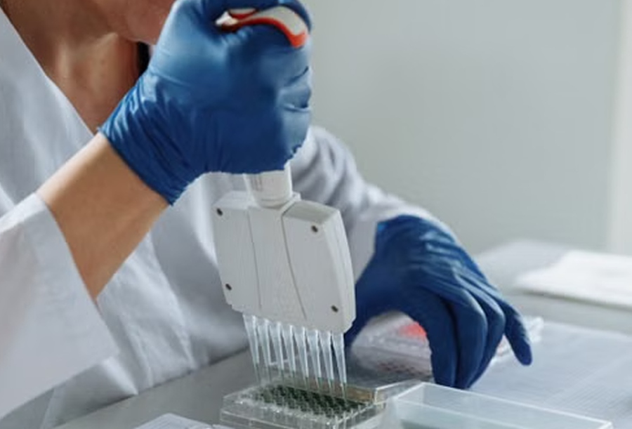
In technical terms, Labfolder is a web-based application to help scientists keep their data centralized while making it collaborative.The specialized format of the ELN allows the scientists to upload and visualize any type of format required in the lab, which also includes heavy, high-resolution images coming from microscopes and other lab devices, making it a powerful tool not to miss any detail in research.
Project overview
| Company | Labforward GmbH |
| Product | Electronic Laboratory Notebook (ELN) Web App |
| Team | Product & Engineering Department → Product Team |
| Roles | Senior Product Designer I; Product Owner, UX Designer |
| Scope | UX, UI, design system, information architecture; product specifications |
| Tools | Figma, UXPin, Illustrator; Jira |
| Timeline | Nov 2019 - June 2022 |
I was in charge of redesigning Labfolder as the only design contributor in the team from 2015 to 2022.
The first milestone was the Notebook redesign, which included:
• Redesign of the user experience and user interface, including entry browsing, filtering, creating, hiding and sharing.
• Design from scratch of functionalities like a WYSIWYG text editor with LaTex support, an integration to a table editor with complex formula support, an integrated chemical formula drawer for chemistry purposes, a self-built file upload and visualization mechanism, as well as a self-built microwell plate editor for biology purposes to integrate with lab devices to read well plates.
The second milestone was the redesign of the collaborative aspect of the ELN, which was ruled by permission-based definitions and which included:
• Redesign of the group management experience
• Redesign of the project and template management experience
• Redesign of the data export mechanism and its experience
Plan
The series of steps to tackle the ELN's redesign, that will be explained thoroughly as you continue reading this case study:
1) Research and find out
User research is to be conducted, including the Engineering Team. Focus groups and interviews are the best methods for this purpose, and the outcomes will dictate the journey prioritization.
2) Prioritize journeys
Together with the Product Manager, prioritize the design of those features that affect the largest groups of users, taking into consideration engineering dependencies.
3A) Start the design ops phase
A new design system needs to be built to match the company's new branding, following the Material Design specs from Google to be implemented with Aurelia, a frontend framework.
3B) Start the UX phase
According to the outcome of the prioritization, wireflows will be created and discussed with the Engineering Team to assess feasibility and to have an implementation estimation.
4) Start the UI phase
Once the wireframes and the specs are finalized by feature, and when the design system is * almost * finalized, the creation of the final deliverable screens will start.
5) Test the UI
Because the end users fixate too much on details, final screens are needed to perform tests so they can understand what is going on and perform tasks. Here, feedback will be gathered to make adjustments to the flows.
Research & Findings
👩🏻🏫 1 stakeholder workshop per month
to understand the expectations of every department regarding specific features to have an initial plan for the designs to be later validated with users.
Findings
👉🏻 Most of the feedback gotten from these workshops had to do with new features for the Notebook particularly, such as a better text editor, a better table editor, a better image editor, a new chemical formula drawer, a new microplate reader and editor, among others.
👉🏻 The improvement that everyone agreed on was to change the Notebook's layout to be more flexible and to look less "boxy".
💬 20 user interviews per quarter
to validate if the designed user flows for all features planned for that quarter were understandable and friendly to users.
Findings
👉🏻 Users were struggling a lot with the loading time of the Notebook, which could be greater than 20 seconds at times.
👉🏻 Users were struggling to find entries within the Notebook that were created by them or by other colleagues in their same team. The filters implemented until then were not really helping users.
👉🏻 A feeling of mess reigned overall when it came to working with the Labfolder as a product, due to the navigation and the UX that relied heavily on filters, but also due to how the entries were presented in the projects.
Some user opinions
I understand the reason why the ELN looks like it does, but I can't help thinking I'm working on Windows 98. The interface feels very clunky and inflexible.

Jacques, Postdoc in Microbiology, Charité
Opening the Notebook means I have to actively filter for a project and then my entries, and then sort them by last edited in order to find the entry I was working on yesterday. This is a productivity nightmare.

Knut, Researcher, LMU
As a group lead I need to screen several entries almost at once to make sure my group is working on its assignments. But the infinite loading combined with how the filters are designed make the whole experience far from great. The Notebook loading time can be equal or greater to 20 seconds.

Ingo, IT Manager and Group Lead, BIH
🧑🏻💻2 engineering breakdown sessions per month
or per sprint, to talk to the engineers about the planned features and how those could fit into the existing monolith architecture.
Findings
👉🏻 The loading time of the Notebook was due to the images uploaded into the system: Scientists do need to upload microscopy images, for example. These images coming from lab devices are usually very heavy.
👉🏻 Another aspect to consider was the filtering experience combined with the endless scrolling experience. This was not good when thinking of heavy data sets, heavy images, and lots of users to filter for. The API calls were being done when a new filter criterion was used, so this resulted in a very clunky experience for the end user, because every call could take up to 5 seconds.
👉🏻 The redesign needed to be split into several phases to avoid a complete shutdown to rebuild:
- Phase 1: Reskinning the Notebook with minor visual changes.
- Phase 2: Rebuild the entire product along with its BE little by little.
Prioritized journeys
Concluded from the research phase, the journeys the PM and I decided to work on first, considering engineering dependencies, were:
First Notebook experience to tackle the "sense of mess"
This included how the user experiences the Notebook when they get to it: How can they find the Notebook and how do they see their entries. This meant concretely:
• ELN Navigation
• Notebook structure to improve entry visualization
•• Entry navigation
•• Entry header
•• Entry content
• Clarity of entry actions, so users would not have any doubt of what could they do with their information.
Filtering experience to tackle the extensive loading time
This included how to present the filters and how to trigger the filtering mechanism.
Search experience to tackle the lack findability of information
This included how to create an Advanced Search mechanism based on logic operators.
Design Ops
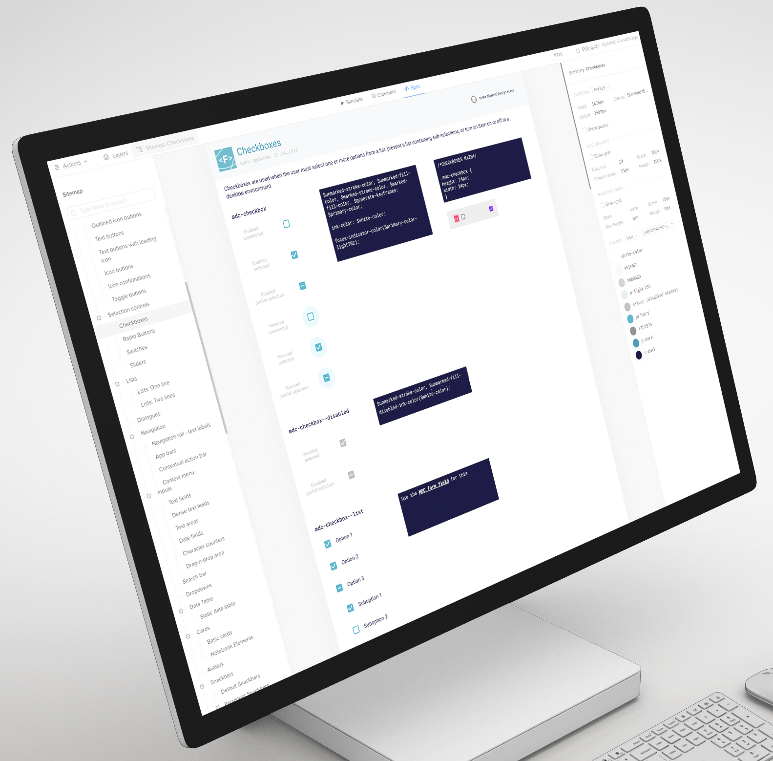
The new design system that was created for Labfolder followed WCAG standards, Material Design standards, and labfolder's new branding after the company merger that gave birth to Labforward.
It was structured in 3 parts: Assets, Styles, and Components. Here's a glimpse of one of the components, the Checkboxes, and how they were presented with development specs (way before Figma even had that option).
Design solutions
In this section, I will condense the UX, UI and test phases described in the Plan by feature. Nevertheless, I will only focus on certain features to keep the case study succint.
ELN main navigation
3 main menu items and a lot of subitems nested in them - this resulted in constrained visibility of everything that could be found in Labfolder.
First, I needed to map all the navigation items and clarify what they contained.
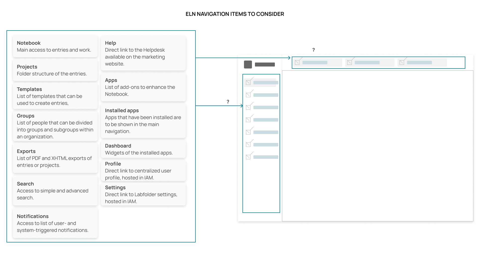
Different layouts were presented on paper back then, and the one that made more sense was the one featuring a side navigation, due to the number of items that had to be visible at first glance. Here is a wireframe of the chosen solution:
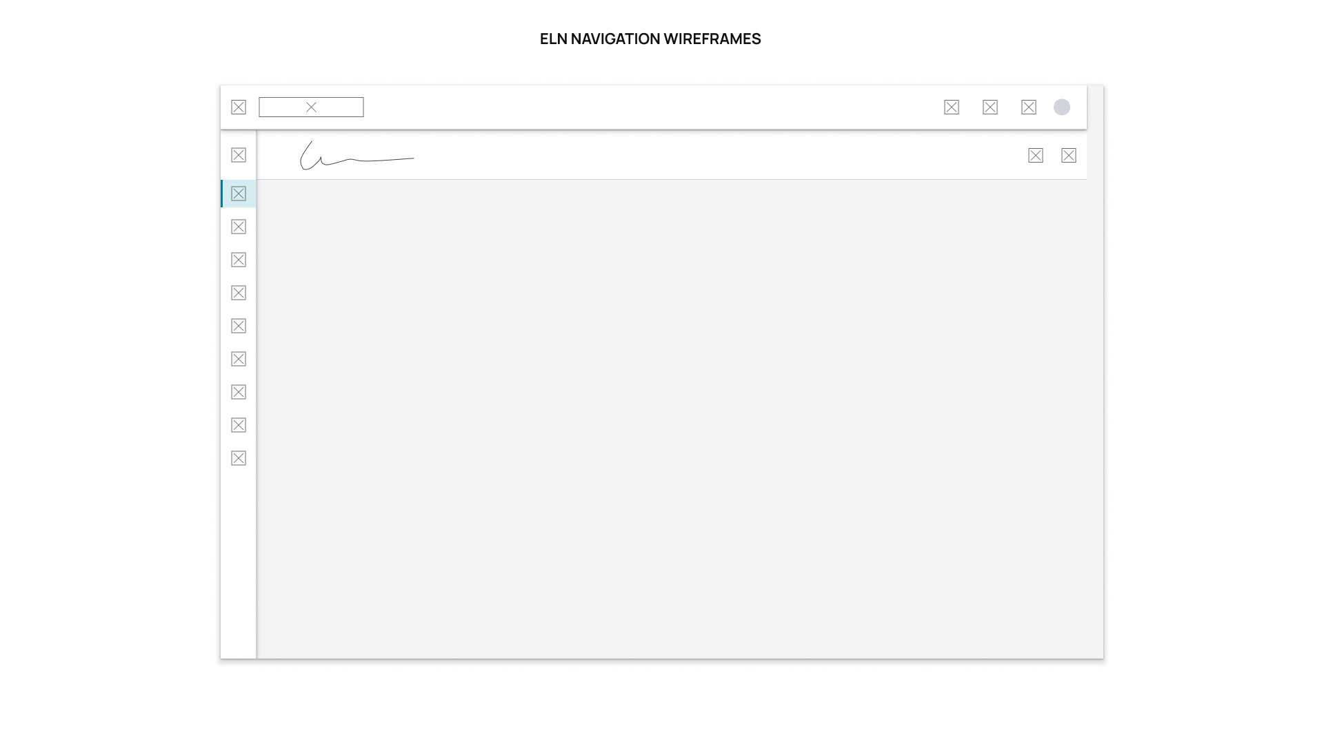
I collaborated with the Marketing and the Customer Success Leads to collect feedback on the navigation. Both of them already had a lot of information regarding this topic, and it validated the idea of having a side navigation.
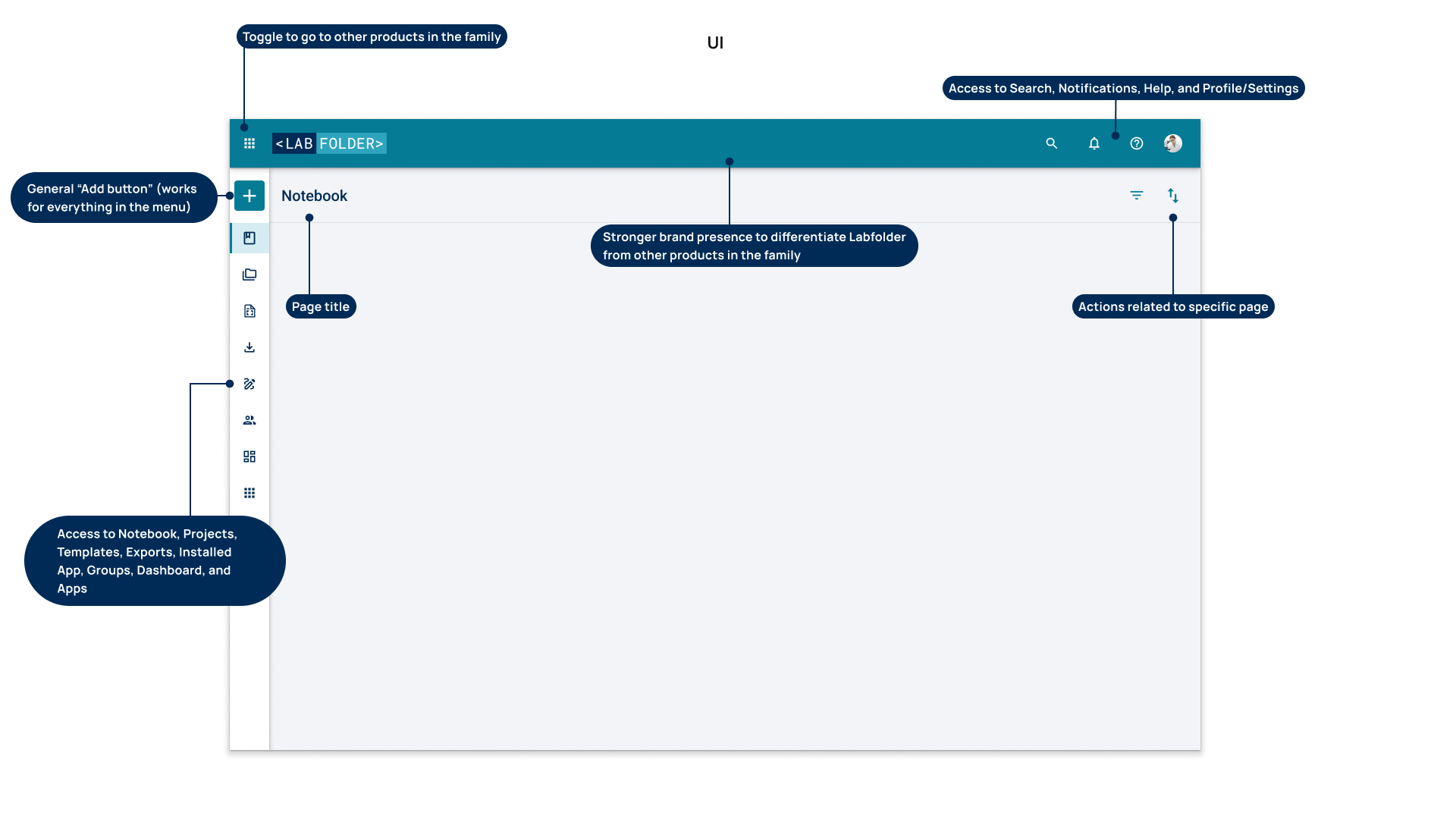
• After a survey sent by the Customer Success Team, we got good feedback on the navigation - users expressed it was much easier and neater to explore Labfolder having the side menu. Some of them said they even found options that didn't know existed!
Notebook structure
Entry list (navigation)
The Notebook view is like a never-ending feed of all entries sorted by user preferences. Users can effectively see ALL content being published by peers in their department, and unless author filters are applied, the amount of information becomes unreadable. There is no immediate way to visualize an author's entry without applying a filter manually. There is no way MY information can be found at first glance.
API endpoints and backend in general isn't modelled to support single entries, and that needed to change.
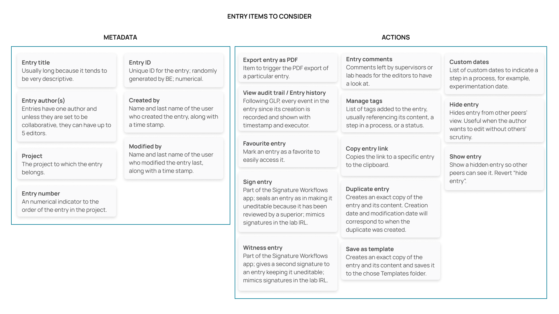
What do users need to identify at first glance from an entry? That was the first question to answer. I mapped the available entry metadata first.
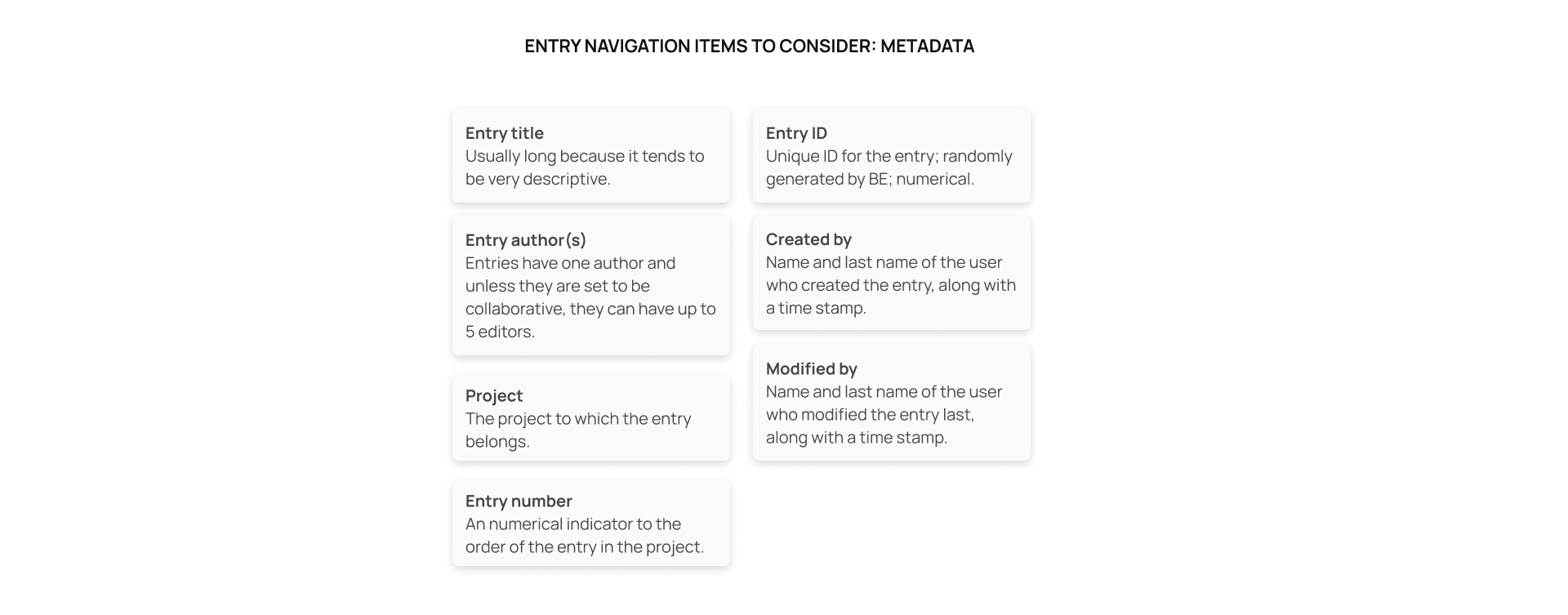
After that, I conducted an exercise with 15 users in a workshop on site to narrow down the most important metadata to them.
They were free to draw on paper, use the whiteboard, or use Word or Excel if it felt easier for them.
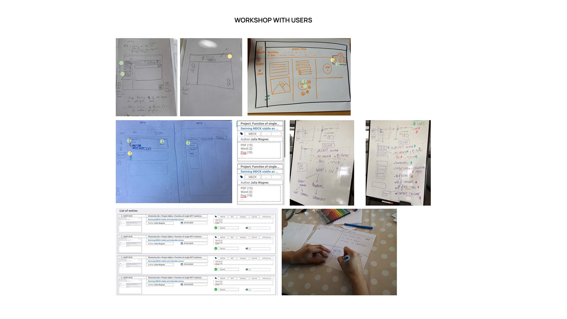
From this exercise, I could conclude that the most important metadata was the entry title, the last modified date, and the user who modified the entry last.
Another conclusion here was the need to have an entry sidebar to be able to quickly navigate through entries without necessarily browsing the entire content. This would give users a sensation of organization by following certain page order.
The project title and tags were also added, but users said in the end this could become too much information to screen when looking for entries.
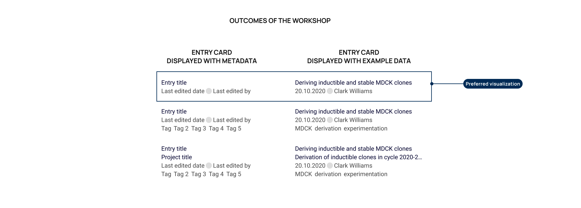
During this workshop, I presented a wireframe with the entry list. This was said to fulfill the needs of the users.
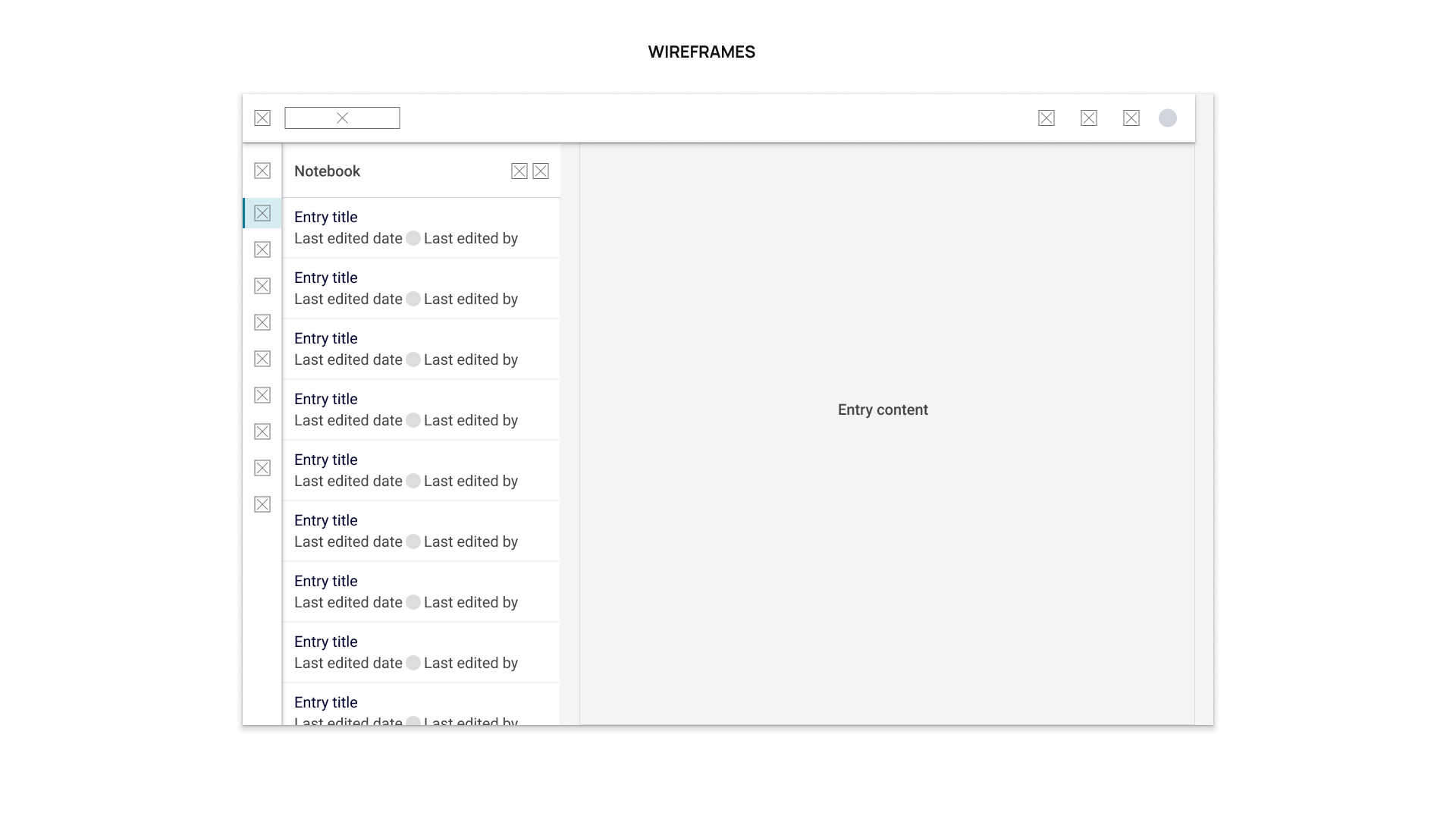
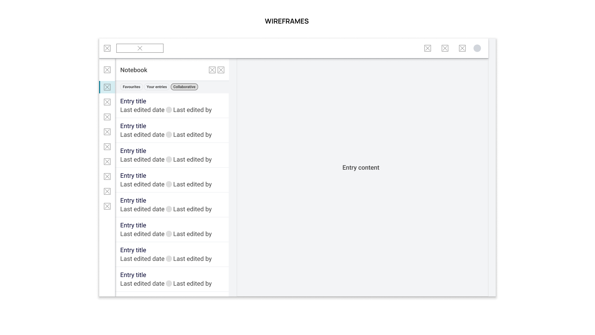
I additionally suggested to add quick filters to help users find their entries, in addition to the preset filters from the panel. The picked ones were:
• Show my entries (in any project)
• Show the entries in which I'm a collaborator
• Show my favourite entries
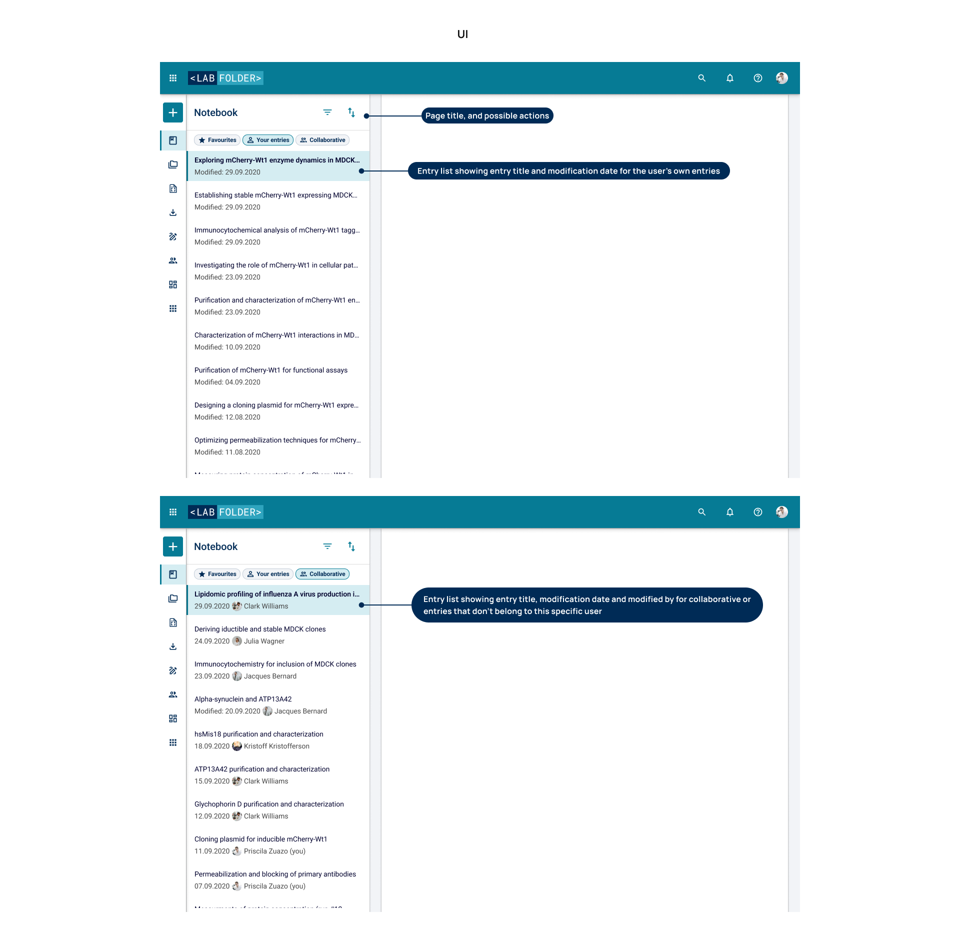
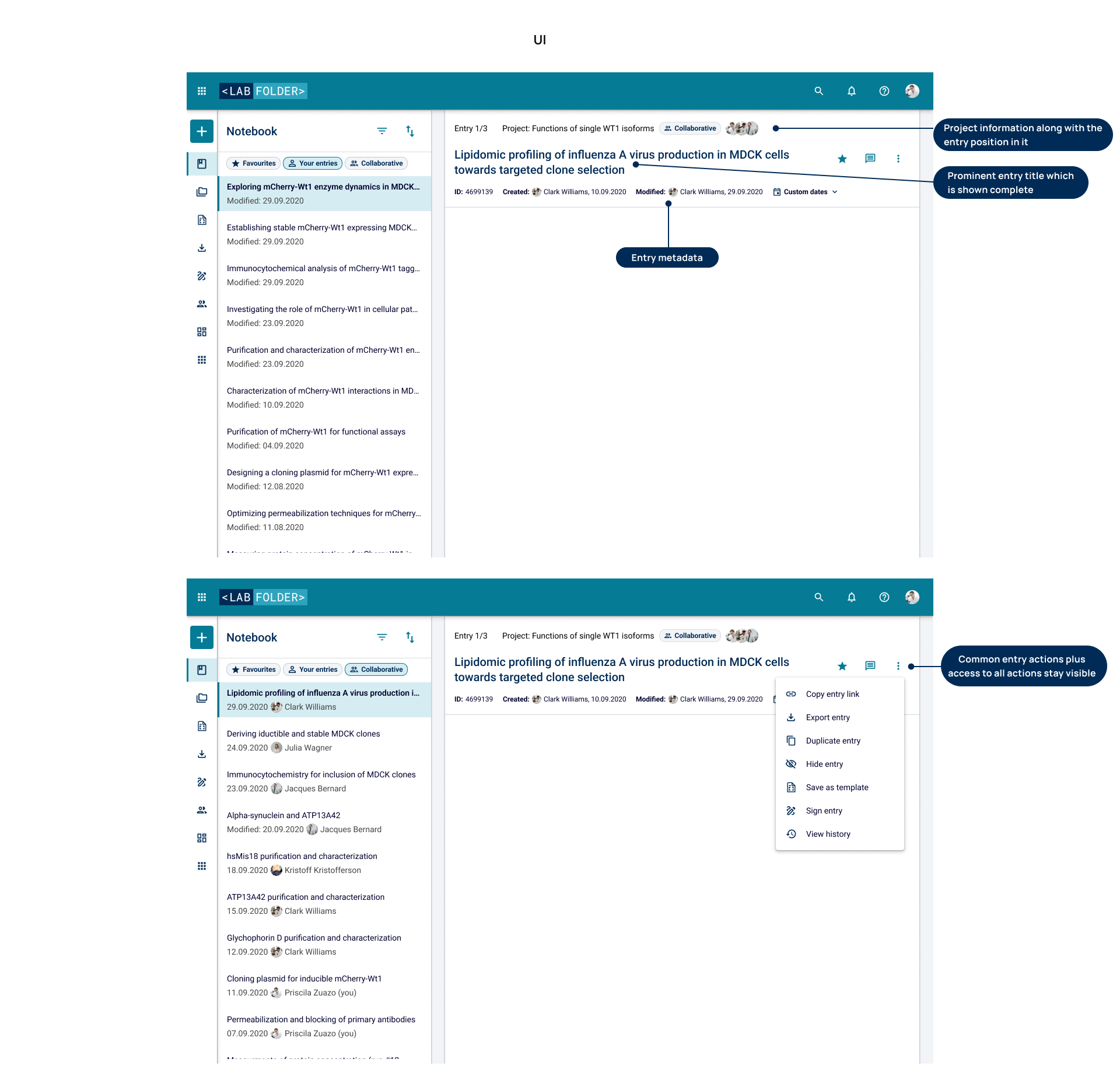
• These screens were really liked by users when performing user tests. ❤️
• Sadly, the entry list was deprioritized by the management as it wasn't seen as a critical business priority.
Entry header
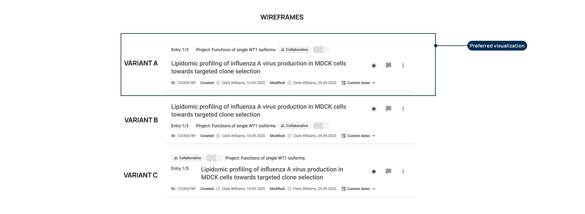
The entry title wasn't prominent enough. The whole area for the header looks like a metadata container, so users just tend to ignore it, making them repeat the metadata as content in the entry, in form of big titles, for example.
Having the research question that was previously asked answered (What do users need to identify at first glance from an entry?), I played a little with the layout of the entry header, but also adding the actions that were a must at the entry level.
I created 3 variants to be validated by users. This time I used a simple online poll to gather preferences and opinions. These are the variants and the winner:
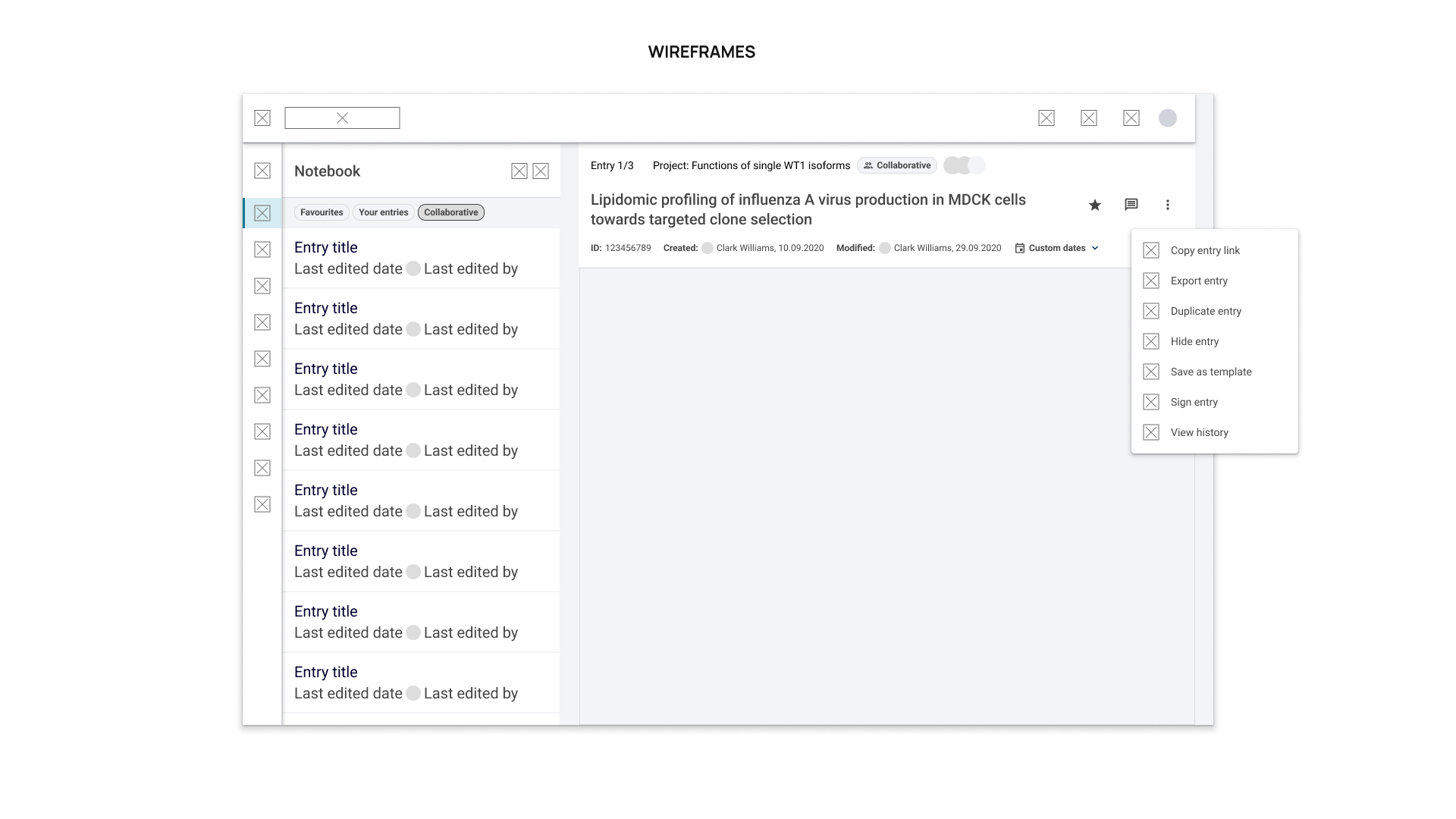
This is how the entry header looked with the rest of the page:
Learnings
🧠 A whole new world
This was my first project as a *product* designer and with it I learned to widen my horizon beyond UX and UI. I started consider business needs, engineering limitations, and how to prioritize following product rules and metrics. A hollistic approach that, without a doubt, gave me the wheels I needed to tackle any other product redesign.